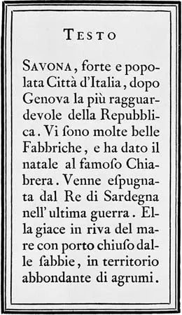
Typography is far more than just picking fonts for a document. It is the deliberate design or selection of letter forms to organize into words and sentences. Those words get printed or displayed electronically. The practice traces its roots back to the mid-15th century, right after the invention of printing with movable type. Before that, scribes did everything by hand.
The three major type families in Western printing history are roman, italic, and black letter (Gothic). Each came from the scripts of calligraphers. Their work was eventually replaced by the press. Over the centuries, typographers have created some 10,000 typefaces. A typeface is a complete set of letter forms of a particular design.
Style matters. Typefaces are categorized as old style, transitional, and modern. This classification depends on the style of their letters. Some of the most commonly used typefaces include Caslon, Baskerville, Bodoni, Garamond, and Times New Roman. The selection of a typeface is an important part of the aesthetic process in graphic design.
Key Figures in Type Design
The history of typography is tied to specific names. You might recognize John Baskerville. He is linked to the Baskerville typeface. Giambattoni Bodoni is another key figure. His name is associated with the Bodoni style. Stanley Morison also played a significant role in the evolution of type design.
These figures helped shape the look of printed text. Their work influenced how we read today. The transition from calligraphy to printing changed everything. It made text more uniform. It also made it more accessible.
Why It Matters for Digital Design
Today, typography is not just about print. It is about screens. How letter forms are organized affects readability. It affects user experience. A poor choice of typeface can make content hard to read. A good choice can enhance understanding.
The categorization of typefaces into old style, transitional, and modern still applies. Designers use these categories to set the tone. Old style types often feel traditional. Modern types can feel sleek and current. The choice impacts the message.
Common Typefaces and Their Uses
Caslon, Baskerville, Bodoni, Garamond, and Times New Roman are everywhere. You see them in books, websites, and apps. Each has a distinct character. Garamond feels classic. Times New Roman feels formal. Bodoni feels high-contrast.
Understanding these differences helps in making informed design choices. It is not just about personal preference. It is about context. The aesthetic process in graphic design relies on these nuances.
The Evolution from Scribes to Screens
The shift from calligraphy to movable type was huge. It standardized letter forms. It allowed for mass production of text. This standardization led to the 10,000+ typefaces we have now. The variety allows for specific stylistic choices.
Black letter, or Gothic, type is less common today. It has a distinct, historical look. Roman and italic remain staples. They are versatile. They fit a wide range of design needs.
Typography is a foundational element of communication. It shapes how we perceive information. Whether printed or electronic, the design of letter forms matters. It influences readability and aesthetic appeal. The choices made by designers have lasting effects.