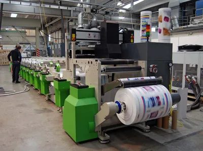
Let’s get one thing straight. If you think printing is just ink on paper, you’re living in the past. Historically, sure, it was about slapping coloring agents onto a surface under pressure to make text or images. But today? That definition is too small. It’s now any technique for reproducing identical copies of text and illustrations on a durable surface. Black and white. Color. Doesn’t matter. The core idea remains: duplication.
The history of this industry is basically a slow-motion explosion away from its roots. We started with lead, ink, and the mechanical press. We ended up with processes that don’t even rely on pressure or physical coloring agents anymore. It’s a progression. A movement away from the material constraints of the 15th century toward something more fluid.
Why printing matters in a digital age
People love to say printing is dying. They point to radio, television, film, microfilm, and tape recording as the new kings of information storage. And honestly? Printing helped create those rivals. By multiplying knowledge on a massive scale, it created the demand for faster, more varied media. But printing didn’t just vanish. It expanded.
It’s not just about books and newspapers anymore. You see it on textiles. On plates. Wallpaper. Packaging. Billboards. It’s even used to manufacture miniature electronic circuits. The field is immense.
The competition is real, though. Some observers think traditional printing is destined for the scrap heap of history. They’re wrong. Here is why.
The permanence of print vs. the fleeting nature of video
Audiovisual media has speed. It has immediacy. Radio scripts and TV pictures deliver facts right now. But they’re gone just as fast. They are fleeting.
Printed texts are different. They take longer to produce. But they are permanently available. They allow for reflection. You can go back. You can reread. You can highlight.
“Print, on the other hand, is directly accessible, a fact that may explain why the most common accessory to electronic calculators is a mechanism to print out the results of their operations in plain language.”
Other storage methods—holograms, punch cards, tapes—save massive amounts of data in tiny spaces. But you can’t just look at them. You need apparatus. Readers. Amplifiers. Enlargers. You need a machine to translate the data into something your senses can handle.
Print needs no translator. It is accessible by human eyes directly. That accessibility is its superpower. It’s why printing isn’t disappearing. It’s evolving. It’s associating itself with electronic means of information disposal.
How printing shaped modern society
Think about when this all started. The invention of printing coincided with the dawn of the age of discovery. It wasn’t just a response to the times. It was a stimulus. It helped transform economic, social, and ideological relations.
The economic world was changing. The Italian republics were hitting high levels of production and exchange. The Hanseatic League and Flemish cities were seeing a commercial upsurge. Socially, the landed aristocracy was declining. The urban mercantile bourgeoisie was rising. These new powers wanted a political role. They needed ideas to justify their economic ambitions.
Printing provided that platform.
The first major role of the printed book was spreading literacy. It spread general knowledge to these new economic powers. At first, princes scorned it. They didn’t get it. But the content shifted. Literary works. Scientific texts. Religious material. First Catholic. Then Protestant. The broad dissemination of religious material accelerated quickly.
Why Europe won the typography race
Here is a material explanation for why printing developed in Europe in the 15th century rather than in the Far East. The principle of movable type had been known in the Orient for a long time. So why the delay?
It comes down to the alphabet.
European writing is based on an alphabet. A limited number of abstract symbols. This simplified the problem of developing movable type manufactured in series. You need a few blocks. You can mass-produce them.
Chinese handwriting is different. It uses a vast number of ideograms. We’re talking about some 80,000 symbols. That doesn’t lend itself well to the requirements of typography. You can’t easily mass-produce 80,000 unique type blocks.
This linguistic difference had a profound effect. The Oriental civilization, despite its richness and advanced status, experienced a slowing down of its evolution compared to the formerly more backward Western civilizations. The writing system itself became a bottleneck for rapid information replication.
The acceleration of knowledge
Printing didn’t just record knowledge. It participated in its growth. It gave it impetus.
In each succeeding era, more people could assimilate the knowledge handed to them. And then they added their own contribution. The feedback loop accelerated.
From Diderot’s Encyclopédie to the profusion of publications printed throughout the world today, there has been a constant acceleration of change. This process was highlighted by the Industrial Revolution at the beginning of the 19th century. And then again by the scientific and technical revolution of the 20th.
Social relations changed too. Industrial development and economic transformations made alterations in society possible. Printing facilitated the spread of the ideas that shaped those changes. Books. Pamphlets. The press. Information of all kinds reached all levels of society in most countries.
It’s not just about the technology. It’s about who gets to hold the information. And for the first time in history, the masses could hold it directly. No machinery required. Just eyes and paper. Or whatever surface comes next.
The Chinese Foundation
By the late 2nd century CE, China had already assembled the three pillars necessary for printing: paper, ink, and carved relief surfaces. They had the paper for decades. The ink formula was 2,500 years old. The surfaces? Those were either Buddhist classics carved into marble pillars or religious seals.
Pilgrims would press damp paper against those marble texts. They’d dab ink on the surface. The raised parts held the ink. The result was a copy. Seals worked similarly, transferring prayers to paper. This seal usage likely drove the development of a thicker, more consistent ink needed for actual printing by the 4th or 5th century.
Wood blocks replaced marble and seals around the 6th century. They were easier to handle. The process was precise. You wrote text on fine paper. You stuck that paper, ink-side down, onto a smooth wood block coated in rice paste. The paste pulled the ink off the paper and onto the wood. An engraver then carved away the empty spaces. The text remained in relief, but reversed.
Printing was manual. You inked the block with a brush. You laid paper over it. You rubbed the back with a brush. One side only.
The earliest known printed works came from this method. Japan produced Buddhist incantations ordered by Empress Shōtoku between 764 and 770. China published the Diamond Sūtra in 868, the first known book. Then came the massive undertaking starting in 932: a 130-volume collection of Chinese classics, initiated by Minister Fong Tao.
Movable Type Experiments
Movable type appeared in China roughly between 1041 and 1048. An alchemist named Pi Sheng created it from clay and glue, baked hard. He arranged the types on an iron plate coated with resin, wax, and ash. He heated the plate gently. The mixture melted. He placed the types. Then he let it cool. The plate solidified, locking the type in place. After printing, he reheated the plate to detach the types. It was a complete cycle. Manufacture. Assembly. Recovery. Infinite reuse.
Another inventor, Wang Chen, emerged around 1297. He had over 60,000 characters carved onto movable wooden blocks for agricultural texts. He also invented revolving compartmented cases to organize the type. His book, Nung Shu, published in 1313, didn’t use his own method. It used traditional woodblocks. Neither Pi Sheng’s nor Wang Chen’s innovations stuck in China.
Korea took a different path. Typography appeared there in the first half of the 13th century. King Taejong spurred development. In 1403, he ordered 100,000 bronze type pieces cast. Nine more fonts followed until 1516. Two sets were made in 1420 and 1434. This predates Europe’s discovery of the technology.
Paper Travels West
Paper stayed Chinese until it moved along Central Asian caravan routes to Samarkand. From there, it spread across the Arab world as a commodity. The technique followed the same path. Chinese prisoners taken at the Battle of Talas near Samarkand in 751 shared the secret with the Arabs.
Paper mills exploded from the late 8th to the 13th century. They started in Baghdad, moved to Spain under Arab rule. By the 12th century, paper entered Europe as an imported good through Italian ports tied to the Arab world. It likely traveled overland from Spain to France too. Europeans probably reverse-engineered the process by studying the material itself. Returning crusaders or merchants might have brought the secret back in the mid-13th century.
Centers grew in Italy after 1275. France and Germany followed in the 14th century.
Typographic knowledge did not follow the same easy path. It seems to have been assimilated by the Uighurs on the borders of Mongolia and Turkistan. Early 14th-century wooden cube typefaces found there prove this. Nomadic educators often spread knowledge to other Turco-Mongolian peoples. It’s plausible they carried it as far as Egypt.
But there, it hit a wall. The Islamic religion accepted paper for recording the word of Allah. It likely refused to allow that word to be reproduced artificially. So the technology stalled.
The European Convergence
The essential elements of printing slowly collected in Western Europe. The cultural and economic conditions were finally ripe.
By the time printing reached Europe in the late 14th century, the technology looked nothing like what we recognize today. It wasn’t a revolution. It was a clumsy, expensive trial-and-error process that relied on xylography —or woodblock printing.
Marco Polo never saw it coming. He missed the fact that Chinese printers had been using wood carving for years. Europeans didn’t know about it either. They stumbled onto the technique accidentally. The catalyst? Paper.
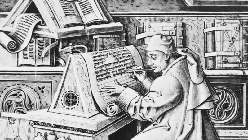
Paper was smoother than parchment. Rough parchment tore under the pressure of a wood relief. Paper held up. Copyists started using wood blocks to stamp ornamental initials. It worked. Suddenly, monks weren’t just copying text by hand. They were stamping images.
First, it was just pictures. Then, short texts accompanied the images. Eventually, the text became the focus. By the early 14th century, scribes were producing small, genuine books. Religious works. Latin grammar compendiums known as donats. The method was identical to the Chinese approach. Carve the whole page into a single block of wood. Press. Print.
It seemed logical that the next step would be obvious. If you can carve a whole page, why not carve individual letters? You’d have a library of reusable type.
The Wood Type Dead End
Enter Laurens Janszoon Coster. A Dutchman from Haarlem.
Historians suggest Coster might have experimented with movable type as early as 1423 or 1437. The results were mixed. Large type? It worked. The concept of typographic composition held water.
But small type? Disaster.
The Roman alphabet letters were tiny compared to Chinese ideograms. Carving them individually from wood was a nightmare of precision. And wood is fragile. Even if you carved them perfectly, the blocks wore out fast. Worse, no two carved letters were ever identical. Just like hand-engraved woodblocks, every print showed slight variations.
It offered no advantage in speed. No advantage in durability. No advantage in quality.
It was a dead end.
Metallographic Printing: The Real Ancestor?
If wood failed, what worked? Metallographic printing.
The timeline is murky. Records are sparse. But it’s highly likely that this technique, dating back to around 1430, was the true ancestor of modern typography.
Medieval guilds already knew the tricks. Metal founders. Die-cutters. Goldsmiths. They used dies daily. The realization was simple: you could apply die-striking to text.
The process was complex. It happened in three steps:
- Engrave a letter into a brass or bronze die.
- Strike that die into a clay or soft metal matrix to create a mold.
- Pour molten lead into the matrix to cast a small relief plate.
The theoretical benefits were massive. You only needed to carve one die per letter. That single die could create unlimited identical copies. The lead castings were faster to produce than wood carvings. And lead lasted longer than wood. If you cast multiple plates from the same matrix, you could scale up printing rapidly.
This technique appeared in Holland around 1430. It spread to the Rhineland. Johannes Gutenberg used similar methods in Strassburg between 1434 and 1439.
It wasn’t perfect. The cast plates were problematic. Striking each die with consistent force was nearly impossible. Alignment drifted. Each strike deformed the adjacent letter.
Yet, the value wasn’t in the final product. It was in the association. The die. The matrix. The cast lead.
These concepts stuck. The failures of wood and the rough edges of early metal printing paved the way for something better. Something precise.
The technology was sitting right there, waiting for the right combination of materials and mechanics. The pieces were in place. The next move would change everything.
The movable type and the printing press were a matched set. One couldn’t really work without the other in the European context. Gutenberg figured that out. The East had press-like ideas, but not the full package. They didn’t have the concept of a mechanical press driving a flat bed against paper.
Credit usually goes to Johannes Gutenberg. It’s messy. There are disputes. There’s always disputes. But the timeline holds up.
Who actually built the first press?
Gutenberg’s name isn’t on the pages. Not literally. The 42-line Bible of 1455 is his work by deduction. You have to look at the technical cross-checking. The earlier stuff, like the donats from 1445 or the Astronomic Calendar, is too imperfect to be the flagship work. The later pieces show mastery.
The assumption is simple. Gutenberg was a silversmith. He knew metal. He partnered with Johann Fust, a businessman, and Peter Schöffer, a calligrapher. All in Mainz, Germany.
Then the partnership imploded. A lawsuit in 1455. Gutenberg lost. The court documents are obscure, but they suggest Gutenberg retained the role of designer and engineer. Fust and Schöffer got the cash and the business side.
The case against Schöffer
Peter Schöffer’s son, Johann, later claimed the invention belonged entirely to his father and grandfather. He was bitter. Or protective. Or both.
But here’s the catch. In 1505, Johann wrote a preface for an edition of Livy. He explicitly stated:
“the admirable art of typography was invented by the ingenious Johan Gutenberg at Mainz in 1450.”
Why would he say that? Johann Fust died in 1466. Peter Schöffer died in 1502. After 1502, there was no one left to correct the record. The certainty likely came from Peter Schöffer himself. It’s hard to imagine a new narrative overriding that specific detail after the key players were gone.
How the first type was cast
The process wasn’t magic. It was chemistry and physics.
- The Die: Carve a letter into soft metal. Brass or bronze.
- The Matrix: Pour lead around the die. This creates a mold.
- The Cast: Pour an alloy into the matrix.
The alloy was the secret sauce. Spectroscopic analysis of early type fragments shows a specific mix: lead, tin, and antimony.
Why this mix?
* Tin prevents the lead from oxidizing too fast. It also protects the lead matrix during casting.
* Antimony adds durability. Lead and tin alone would melt or deform under the pressure of the press.
This is the same alloy used today. The formula hasn’t changed in nearly six centuries.
Steel dies and the standardization of type
Around 1475, Peter Schöffer made a crucial upgrade. He replaced the soft-metal dies with steel dies.
Why? To create copper matrices. Copper is harder. It lasts longer. It produces letters that are reliably identical. Before that, the soft dies wore down quickly. The letters varied in height and width. With steel, you get consistency.
This method—steel die, copper matrix, cast type—remained the standard until the mid-19th century.
The typographer’s four steps
Setting type wasn’t just printing. It was assembly. It was labor-intensive.
- Picking: Take the letter pieces one by one from the typecase. Each compartment held a specific character.
- Composing: Arrange them side-by-side in a composing stick. A wooden strip with corners. You held it in your hand.
- Justifying: Space the line out. Use lead slugs (blank pieces of lead) between words to push the text to the margin. The line had to be even.
- Distributing: After printing, break the line back down. Sort the letters back into the case.
It’s a cycle. Pick, set, print, reset. Repeat.
The press itself? That was the other half. The screw. The platen. The bed. The ink. But the type was the voice. Without the type, the press was just a heavy weight. With it, you had a machine for mass communication.
The world wasn’t ready. But the machine was.
The Early Mechanics of the Printing Press
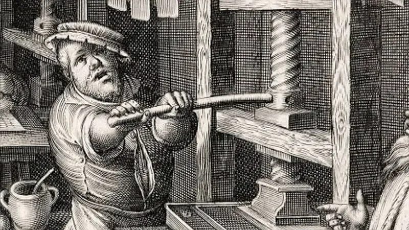
Records from the early 1400s, including a 1439 lawsuit tied to Gutenberg in Strassburg, are explicit. There is little doubt that the printing press was part of the workflow from day one.
The machine likely started as a crude adaptation of a wine or paper binding press. Think of a fixed lower surface called the bed. A movable upper surface, the platen, sat above it. A small bar attached to a worm screw moved the platen up and down vertically.
You locked composed type into a metal frame using ligatures or screws. That frame was the form. You inked it. You laid a sheet of paper on top. Then you squeezed the whole thing in the vise created by the two plates.
This setup beat the brushing technique used for wood-block printing in Europe and China. Why? You got a sharper impression. You could also print both sides of a sheet.
But it wasn’t perfect. Passing the leather inking pad between the platen and the form was a hassle. And since you needed several turns of the screw to get enough pressure, you had to remove the bar, lift the platen enough to slide paper in, and replace the bar. Again. And again.
Most historians agree the press got its main functional features pretty early. Likely before 1470.
How the Screw Press Evolved
The first big leap was a mobile bed. It ran on runners or a sliding mechanism. This let the operator pull the form out after each sheet to ink it again.
Then came the screw change. The single-thread worm screw was swapped for one with three or four parallel threads. The pitch was sharply inclined. Now, lifting the platen required only a slight movement of the bar.
That speed came at a cost. The pressure exerted by the platen dropped. To fix that, printers broke the operation into steps. The movable bed pushed the form under the press. First one half of the form was printed. Then the other.
This became the principle of printing “in two turns.” It stayed standard for three centuries.
Improvements after Gutenberg
The screw press didn’t stop changing. Over the next 350 years, several upgrades mattered.
Around 1550, the wooden screw was replaced by iron. It was stronger. More consistent.
Twenty years later, innovators added a double-hinged chase. This included two key components.
A frisket. This was a piece of parchment cut to expose only the text. It stopped ink from spotting the non-printed areas of the paper.
A tympan. This was a layer of soft, thick fabric. It smoothed out irregularities in the height of the type. The pressure became more regular.
These tweaks didn’t reinvent the wheel. They just made the wheel turn smoother.
The Dutch Press and the Shift to Rotary
Blame Willem Janszoon Blaeu for the automatic platen. Around 1620, this Amsterdam maker added a counterweight to the pressure bar on existing wooden presses. The result? The platen rose automatically instead of requiring manual labor to reset it. This became known as the Dutch press. It wasn’t just a local curiosity either. A copy of this machine traveled across the Atlantic to become the first press in North America. Stephen Daye set it up in Cambridge, Massachusetts, in 1639.
Fast forward to about 1790. The industry was stuck with flat pressure. That changed when English inventor William Nicholson figured out how to use a rotating cylinder for inking. His first versions used leather. Later, printers switched to a goopy mix of gelatin, glue, and molasses. It sounds messy, but it introduced rotary movement to the process. A huge leap from the simple squeeze of a screw press.
The Metal Press (1795)
Wood is heavy. Wood warps. So, around 1795, England saw the first all-metal printing press. It was a structural shift that promised durability, but it took a few years for the mechanics to really click in the US.
An American mechanic built a metal press that ditched the traditional screw mechanism entirely. In its place, he used a series of metal joints. This machine was called the “Columbian.” It didn’t stay the peak for long. Samuel Rust followed it up with the “Washington” press. The Washington represented the ultimate evolution of the screw press lineage that traced back to Gutenberg. It could crank out about 250 copies an hour. That was fast for the era.
Stereotypy and Stereography
Demand for printed matter was exploding. Speed was the bottleneck. The solution wasn’t just faster presses; it was smarter type management. This led to the concepts of stereotypy and stereography.
Stereotypy became a major success tool around 1790 in Paris. The process was simple but effective. You took a block of set type and pressed it into clay or soft metal. That created a mold of the entire page. From that mold, you cast lead plates.
The resulting plates made it economically viable to print the same text on multiple presses simultaneously.
This didn’t just speed up production. It changed the lifecycle of type. The original pieces of type were freed up immediately for other jobs. Recycling became instantaneous because you could make more plates without breaking down the original forms.
There was a variation on this method after 1848. Galvanoplastic metallization used electrolysis. Instead of just casting into a mold, they lined plates with a base of lead alloy. Then, they deposited a coat of copper onto a wax mold of the typeform. It was cleaner. More precise.
Stereography tried a different angle. It wanted to skip the typesetting entirely. Early attempts to stamp dies into a clay matrix failed to produce good results. Then, in 1797, someone tried assembling large numbers of copper matrices for each letter. They arranged these matrices to match the text. Once that covered the bottom of a mold, a lead plate was cast. The matrices were then pulled out and reused. It was a way to bypass the slow, manual labor of composing text by hand.
Koenig’s Mechanical Press
The next logical step was obvious to engineers. Steam power.
The prospect of using steam to drive a press forced researchers to look at the entire workflow. The old methods had distinct, separate steps. Composition. Inking. Pressing. Unloading. If you had a steam engine, you didn’t want it sitting idle while a human set type. The goal was to join all these different operations into a single, continuous cycle.
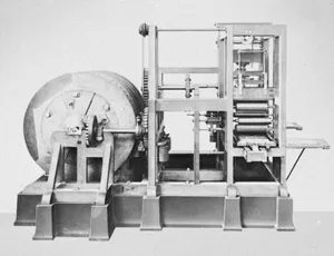
The dream of mechanizing the press didn’t just appear. It took centuries of trial, error, and mechanical engineering to get there.
It started in Germany in 1803. Friedrich Koenig saw it clearly. He imagined a press where gears did the heavy lifting. The platen raised and lowered. The bed moved back and forth. Rollers inked the form. All of it controlled by a system of gear wheels.
Early trials in London in 1811 were failures.
Success required a different approach. It required the mechanized platen press to mature. That happened in the United States. The breakthrough came with the perfection of the “Liberty” press in 1857.
How did it work? A pedal action. You pressed down. This caused the platen to be held against the bed by the arms of a clamp. The result was satisfactory. Reliable. But it wasn’t the end of the story.
Why the Cylinder Won
Nicholson had the vision first. He took out patents early on for a printing process using a cylinder. The composed type pieces would attach to this rolling surface.
He never developed the necessary technology. The engineering lagged behind the idea.
The cylinder was the logical geometric form. Think about it. A cyclical process demands a circle. It’s the only shape that rolls without jumping.
It also provided the greatest output. Energy efficiency mattered.
Consider the physics. With a platen, pressure spreads over the whole surface to be printed. Every square inch gets the same force.
The cylinder? It concentrated pressure.
Only the strip of surface actually in contact with the cylinder at any one instant bore the load. Given equal energy, this concentration meant better impression quality and higher speed. It was a fundamental shift in how pressure could be applied.
The Early Precedents
This wasn’t a new concept. It had been demonstrated earlier.
In 1784, a French press for books for the blind showed the efficiency of the cylinder. It was a limited demonstration. But the principle held.
Nicholson’s failure to build his machine highlights a common theme in tech history. The idea is easy. The execution is hard. The cylinder eventually won not because of patents, but because of physics and the ability to scale.
The cylinder printing press eventually dominated. It moved from blind books to mass-market newspapers. The mechanics improved. The gears got tighter. The rollers got faster.
We still use the principles established then. The basic geometry hasn’t changed much. Just the speed. And the ink.
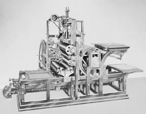
The rotary principle got a serious upgrade in 1811 when Koenig and Andreas Bauer stopped thinking flat and started thinking round. They designed a cylinder that acted as a platen. The paper sat on this cylinder and pressed against a typeform sitting on a moving flatbed.
It was a clever dance. The cylinder rotated as the bed moved forward, pressing the ink. When the bed pulled back to hit the inking rollers, the cylinder disengaged. No waste. No smudge. Just rotation and pressure.
By 1814, the Times of London installed the first steam-driven version of this stop-cylinder press. It wasn’t just faster; it was a double-up operation. Two cylinders spun one after the other, syncing with the bed’s to-and-fro motion. You got twice the copies. The speed hit 1,100 sheets per hour. For the time, that was lightning.
But they wanted to print both sides at once. In 1818, Koenig and Bauer cracked that code with a perfecting machine. A sheet printed on one side under the first cylinder moved directly to the second cylinder. The other side got printed. Perfection.
William Church added the finishing touch in 1824. He gave the cylinder grippers. These mechanical fingers picked up the paper, held it tight during the print, and dropped it automatically when done. It was the first real automation of sheet handling.
The Hoe Revolution and the Fragility Problem
The to-and-fro bed movement in those early cylinder presses was a bottleneck. It created discontinuity. To make the cycle truly smooth and continuous, two things needed to change: the platen had to be cylindrical, and the typeform itself had to be cylindrical.
Richard Hoe solved this in the United States in 1844. He patented the type revolving press, the first true rotary press based on this new principle.
Here’s how it worked: A massive cylinder, huge in diameter, carried columns of type bracketed together on its outer surface. Several smaller cylinders provided the pressure. Hand-feeding workers stood by, slapping sheets onto the smaller cylinders.
The speed? More than 8,000 copies per hour.
It was a powerhouse. Until it broke. The system was fragile. If the type wasn’t locked up perfectly, the vibration of the high-speed rotation would knock the type out of the cylinder. Complete chaos.
Fixing that fragility required a shift in how type was made. They applied stereotypy. Instead of setting individual metal letters into the cylinder, they made an impression of the typeform on a strong pasteboard called flong or mat. This mat was pressed against a curved mold. Then, they injected molten lead alloy into the mold.
The result? Curved, solid metal plates that didn’t fall apart.
France started experimenting with this in 1849. The Times in London adopted it regularly by 1856. By 1858, curved stereotype plates were the standard. The press was stable. The speed remained.
Feeding the Beast with Rolls
Even with stereotypy and rotary motion, one part of the process was still manual: feeding the paper. The press could run fast, but the worker had to place each sheet by hand.
The solution was already in the wings. Techniques for producing paper in a continuous roll had existed since the start of the 19th century. They just hadn’t been married to the press yet.
In 1865, William Bullock of the United States built the first roll-fed rotary press. He took that continuous roll of paper and ran it through the machine. After printing, a device cut the continuous stream into individual sheets.
The output was staggering. 12,000 complete newspapers per hour.
By 1870, automatic folding devices joined the party. Bullock and Hoe designed them. The paper wasn’t just printed and cut. It was folded into a newspaper format automatically. The entire chain—from roll to folded sheet—was mechanized.
Later iterations of rotary presses used all sorts of curved plates. Electrotype plates were curved and then backed. Rubber or plastic plates were molded or created via photomechanical processes. Metal wraparound plates came from photoengraving or electronic engraving. The variety expanded, but the core mechanic remained: continuous rotation, continuous feed.
Attempts to Mechanize Composition
Printing was speeding up. But setting the type—the composition process—was lagging behind.
Mechanizing composition was hard. The 19th century struggled with it.
In 1806, a compression mold opened doors for mechanizing type production. Then, in 1822, William Church of Boston patented a typesetting machine. It had a keyboard. Each key released a piece of type stored in channels in a magazine.
Church avoided the biggest headache: distribution. He annexed a device to the magazine that constantly cast new pieces of type. Smart move.
But the machine had limits. The typesetter still had to assemble the pieces by hand. And justify the lines. Justification meant estimating the space between words to make the line even. It required human judgment. You couldn’t automate intelligence easily.
Over the next 50 years, machines based on Church’s principle appeared. Some added mechanisms to place type pieces the right way up. One of these machines composed more than 10,000 pages of the ninth edition of the Encyclopædia Britannica.
The speed was impressive. 5,000 to 12,000 pieces per hour. Compare that to hand composition, which maxed out around 1,500. The gap was widening.
But the output was just a continuous row of type. It still had to be divided into lines and justified by hand.
So, engineers added a mechanical distributor. Think of it as a reverse compositor. Used type lines passed before the operator. The operator pressed the corresponding key on his keyboard. This opened the channel in the magazine for that specific piece of type to be reused.
It worked. But the speed of mechanized distribution stalled at about 5,000 pieces per hour. It wasn’t faster than hand distribution.
The Bottleneck of Intelligence
Mechanizing letterpress composition hit two walls.
First was justification. The machine couldn’t decide how much space to leave between words. It lacked the intelligent estimation required for clean typography.
Second was the timeline. Type was used for printing, then it had to be returned, sorted, and redistributed. That delay kept composition and distribution from merging into a single, continuous cycle.
The press could run at 12,000 an hour. But the typesetter was stuck at 5,000, struggling with space and sorting. The machine was ready. The human element was the bottleneck.
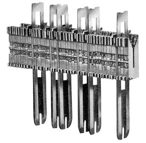
By the time the 1880s rolled around in the United States, printing had stopped being just about stacking individual letters. It became about speed. Ottmar Mergenthaler, a German-born inventor, changed the game with the Linotype machine.
It wasn’t just a typewriter. It was a typecasting compositor. You know how traditional letterpress worked? You set each character by hand. Mergenthaler figured out how to cast a solid one-piece line of type—a slug—from movable matrices.
Here is the clever part. Each matrix had an individual notch. Use it? It slides back into its proper slot in the magazine. No mixing up the “E”s and “F”s. Justification? That happened automatically. The machine inserted wedged spacebands between groups of matrices right after forming the words. The matrices did the work. The lead did the printing.
The result? 5,000 to 7,000 pieces of type per hour. That was insane velocity for the time.
The Monotype Alternative
Two years later, in 1885, Tolbert Lanston entered the chat. He built the Monotype machine in the US. It was different. Instead of slugs, it cast individual pieces of type for a line.
How did it justify the line? It counted units. The width of the spaces taken up by the type pieces dictated the spacing. This system meant the matrices were indefinitely reusable. The actual type pieces? Used only for the impressions, then returned to the caster.
Fast forward to the contemporary era (relative to the text’s context), and the Monotype typecaster is controlled by a perforated paper ribbon. It’s fed from a separate keyboard. Output jumps to 10,000 to 12,000 pieces of type per hour. Twice as fast as the Linotype.
Big Type, Manual Assembly
Not everything was fully automated. In 1911, Washington I. Ludlow perfected a machine for large display type. It bears his name, naturally.
But here’s the catch. The matrices were assembled by hand in a composing stick. You inserted that stick above the mold opening. You also distributed the matrices by hand. It was a hybrid approach. High volume for the line, manual precision for the big letters.
The 19th-Century Shift
The 19th century did more than just automate text. It laid the groundwork for printing techniques that had nothing to do with Gutenberg’s screw press. Specifically, it changed how we reproduced images.
Woodcuts vs. Metal Engraving
Xylography, or woodcuts, came first. These were relief prints. You could lock the picture block and the text type into the same form. They printed together. Simple. Efficient.
But by the second half of the 15th century, engraving on metal started competing. Copper. Sometimes brass, zinc, or steel after 1806.
This was intaglio printing. You engraved the plate with a burin or etched it with acid. You inked the plate, wiped it clean so ink stayed only in the incisions, and transferred it to paper under pressure. The press? Derived from the rolling mill.
There was a problem. Intaglio wasn’t compatible with woodcut relief printing. You couldn’t mix them on one plate. Text and illustrations had to be printed separately. For the same book. Two separate passes. Two separate forms.
Mechanized inking arrived later in the 19th century. Rollers. Wiping with revolving cloth bands or rotating disks covered in calico. Capacity was still limited, but the technology was solidifying.
From Textiles to Schoolbooks
The end of the 18th century brought a twist. Intaglio inspired continuous printing for textiles. Pass fabric under an engraved, inked cylinder. Scrapers remove excess ink. Repeat.
In 1860, France applied this to paper. Specifically, school-book covers.
The innovation? A solid copper cylinder engraved with tiny cavities instead of continuous lines. These cavities held the ink uniformly. Gravity didn’t drain it. Centrifugal force didn’t fling it out. The scraper didn’t wipe it clean.
It worked. Only for simple graphics. Complex detail? Still out of reach for this specific continuous method.
Lithography: The Grease Principle
Then there was lithography. Neither relief. Not intaglio. It relied on a chemical fact: water and grease don’t mix.
Aloys Senefelder in Prague figured this out in 1796. He looked at calcium carbonate stone with a fine, porous surface. Draw a design on it with greasy ink. Wet the stone with water. Brush on ordinary ink.
The water repels the greasy ink areas. The stone attracts the fresh ink everywhere else? No. Wait. The stone holds water in the non-image areas. The fresh ink adheres to the greasy design and ignores the wet stone.
Press paper against the stone. You get a reproduction.
Senefelder realized something huge. You could transfer a drawing from one stone to another. Side by side. As many copies as you wanted. One large sheet printed at once. Multiple copies in a single pass.
He also noted that zinc had the same properties as stone. Cheaper. Easier to handle? Maybe. But functional.
He envisioned a press. Stone on an undercarriage. Inked. Paper on top. Pasteboard over that. Pressure applied.
By 1850, this became mechanized. Cylinder press. Flannel-covered rollers for wetting. Rollers for inking.
The final breakthrough came from flexibility. If you could replace the stone with a zinc plate that could be curved, you could build rotary presses. The first one arrived in 1868. Paper passed between the plate-bearing cylinder and the impression cylinder.
Continuous motion. Continuous image. The foundation of modern offset printing.
Photography didn’t just capture moments. It changed how we mass-produce images.
Joseph-Nicephore Niepce started this in the 1820s. He wanted to engrave images automatically onto lithographic stones. Then tin plates. He found that some chemical compounds reacted to light. This discovery birthed photogravure. It led directly to photography between 1829 and 1838. It also paved the way for reproducing photos in print.
How screen technology solved the tone problem
William Henry Fox Talbot, a British scientist, changed the game in 1852. He placed black cloth (tulle) between a tree leaf and a photosensitive steel plate. The result? A picture that kept the fine mesh of the fabric.
Why did this matter? Etching with acid created tiny, juxtaposed pits instead of uniform erosion. The depth of these pits varied by exposure. Talbot had essentially invented the screen. He opened the door for rotogravure.
By the 1880s, the screen improved. They replaced cloth with two sheets of glass. These glass sheets had uniform parallel lines crossing perpendicularly. This allowed letterpress and lithography to reproduce full photographic tones. The mesh diffused light. It converted tone intensity into varying thicknesses of the printing surface.
Why rotogravure took so long to perfect
Intaglio engraving on cylinders faced a wall. You needed to engrave infinite tiny cells directly onto a curve. It was difficult.
Rubbing a squeegee to remove excess ink required a flat surface. A curved plate didn’t provide uniform contact. Photosensitive solutions wouldn’t stick to cylinders.
J.W. Swan of Britain solved part of this in 1862–64. He invented carbon tissue. It was paper coated with gelatin. It became photosensitive before being applied to any metal surface.
Karl Klič, a Czech inventor, took the next leap in 1878. He copied a grid screen directly onto carbon tissue. This transferred the necessary cells for intaglio printing onto a cylinder simultaneously with the image.
In 1895, Klič and English colleagues founded the Rembrandt Intaglio Printing Company. They published picture reproductions by rotogravure. They kept their process a secret.
Parallel patents emerged in Germany and the US. They screened the image before making the impression. But secrets don’t last. In 1903, a workman from Rembrandt emigrated to the United States. He revealed Klič’s method. Rotogravure became widespread.
The shift to speed and offset
The 20th century brought offset. The focus shifted to mass production. Speed mattered. Economy mattered.
Lithography evolved along two paths after mechanical presses were perfected.
- Printing on thin metal sheets (like tinplate for cans) using a transfer process in 1878. The impression cylinder carried the metal but didn’t touch the stone. An intermediary rubber-covered blanket did.
- Printing on paper. This happened infrequently at the end of the 19th century on cylinder or rotary presses.
Ira W. Rubel discovered offset in 1904 at Nutley, New Jersey. An American printer, he had an accident. During a paper-feed stoppage, an image transferred from the plate cylinder to the rubber blanket. He realized he could print from the blanket. The impression was superior.
Rubel and an associate built a three-cylinder press. It was the first offset press. The term stuck.
Dry offset and modern applications
A new problem arose in checks. Printing backgrounds with water-soluble ink prevented forgeries. They needed a solution.
They replaced the lithographic plate with a stereotype plate or letterpress wraparound plate. This combined relief letterpress (no wetting needed) with offset transfer. It’s called dry offset or letterset. It’s not just for checks. It’s used in conventional printing everywhere.
Since 1950, another process developed in the US. It combines rotogravure with offset transfer. Where do you see it?
Wallpapers. Plastic floor coverings. Paper plates.
The tech keeps adapting.
The Slow, Colorful Origins of Modern Printing
You think your home printer struggles? Try this. In 1457, we were already dealing with the headaches of multi-color output. A psalter signed by Peter Schöffer (though some argue it was Gutenberg) featured ornamental capital letters printed in two colors. How? They used two wood blocks that fit one inside the other. Each block got its own ink. It was clunky. It was slow. But it worked.
Fast forward to the 16th century. Germany was experimenting with reproducing images in multiple colors on wood blocks. By the 17th century, printers were applying different inks to different parts of a single engraved metal plate. One press. Multiple colors. Still manual. Still tedious.
Then came 1719. Jacques-Christophe Le Blond, a painter, patented a process in England that changed the game for color printing techniques. He didn’t just slap ink on a plate. He used the three primary colors—blue, yellow, red—plus black for outlines. He engraved four metal plates using a dense grid. Each plate highlighted a specific color’s importance. The paper went through four separate impressions. Four passes. Four colors.
It wasn’t until the 19th century that science caught up. Trichromatism became a defined principle. Photography started analyzing and synthesizing colors. Coatings sensitive to specific wavelengths were perfected. Le Blond’s hand-drawn grid was replaced by mechanical screens. This established the modern trichromatic technique. Add black to the mix, and you get quadrichromacy. The foundation was set.
Automating the Keyboard
Efficiency has always been the goal. From day one, the industry wanted to mechanize composition. The Monotype system offered one solution. It separated the keyboard from the caster. One caster could run at full speed, fed by perforated tapes from multiple keyboards. Better. But still manual input.
The real shift happened around 1929 in the United States. Teletypesetter remote-control composing equipment was perfected. This allowed for the separation of human function and mechanized function. The operator produced a tape. Each letter, symbol, and space was represented by a combination of perforations. A translator device read the tape. It ordered the release of matrices for letters, signs, and justifying spaces.
The results were staggering. Machines casting one-piece fully spaced lines or slugs could produce more than 20,000 characters per hour. That’s not just speed. That’s volume.
Programmed Composition Arrives
Perforated tape was fast, but the operator was the bottleneck. The human had to decide where to break a word at the end of a line. This decision took time. It slowed everything down.
In the 1950s, electronics stepped in. The BBR system, named after its three French inventors, introduced programmed composition. It started with a perforated tape produced by the operator. A computer took over the rest. It determined line length. It decided where to divide words based on grammatical rules and typographic usage. It integrated corrections. It even handled text layout.
The speed was limited only by the perforator. Operating speeds exceeded 300,000 characters per hour. Ten times the capacity of the most modern slug-casting machines. The human was just the starter. The machine was the engine.
Magnetic tape replaced perforated tape in the 1960s. It was faster. About 1,000 characters per second. Or 3,600,000 per hour. Magnetic tape couldn’t drive mechanical composers casting lead type. The inertia was too high. But for machines not burdened by lead weight, it was practical. It was efficient. It was the future.
The Shift to Light
Why use lead to make a proof that gets photographed anyway? It didn’t make sense. Before the end of the 19th century, people considered machines for composing headings by photographing letter images in succession.
In 1915, the Photoline appeared. It was a photographic equivalent of the Ludlow. It assembled matrices of transparent letters in a composing stick. It filmed each line. No lead. Just light and film.
Mechanical Phototypesetters
The next step was adapting existing typesetters. Replace metal matrices with matrices carrying the image of the letters. Replace the caster with a photographic unit. It was a logical bridge.
The Fotosetter arrived in 1947. The Fotomatic followed in 1963, controlled by perforated tape. Both derived from the Intertype slugcasting machine. The Linofilm came in 1950, derived from the Linotype. The Monophoto appeared in 1957, derived from Monotype.
They retained the mechanical limitations of machines designed for lead. They couldn’t achieve appreciably higher rates of performance. Photocomposition needed a rethink. Functional terms only.
Germany explored this as early as the 1920s. The Uher typesetter attached photographic matrices to a rotating disk. It was an idea ahead of its time. But the hardware couldn’t keep up. The concept was right. The execution was still stuck in the mechanical age.
The push for speed: Second-generation phototypesetters
The second generation of phototypesetters was all about stripping away inertia. Manufacturers realized that moving parts were the enemy of speed. They reduced the machinery to just two main components: a constantly rotating disk or drum holding the photographic matrices, and an optical system of prisms or mirrors to direct the light beam from an electronic flashtube.
It started with the Lumitype. Invented in 1949 by Frenchmen René Higonnet and Louis Moyroud as the Lithomat, it changed the game. By 1953, they had used it to phototypeset The Marvelous World of Insects. Early models had keyboards built right into the unit. Later versions used separate keyboards and could print over 28,000 characters per hour.
Linofilm followed suit in 1954. Their electronic machine used shutter blades to select matrices, hitting 12 characters per second—that’s 43,200 an hour. By 1965, their drum-based successor doubled that output. The Photon-Lumitype 713, released in 1957, pushed even harder, hitting 70,000 to 80,000 characters per hour.
But there was a limit. Rotary matrices hit a wall because of centrifugal force. You can only spin so fast before things fall apart or blur.
The Lumizip 900, launched in 1959, solved this by keeping only the lens moving. It scanned a fixed series of light matrices in one pass, capturing a whole line of 20 to 60 letters at once. The output jumped to 200–600 characters per second. That’s over 2,000,000 per hour. This machine relied on magnetic tape to feed data.
The impact was immediate. The first book set on a Lumizip was Index Medicus in 1964. It was a landmark. The 600-page volume was finished in 12 hours. Try doing that on a typecasting machine. It would have taken nearly a year.
The third generation: Going fully electronic
Magnetic tape was still slower than the fastest machines. To close the gap, the industry moved to a third generation in the 1960s. This time, they eliminated all mechanical moving parts. No more rotating drums. No more scanning lenses. They just used light, skipping the complex optics that used to direct it.
Cathode-ray-tube phototypesetters like the RCA and Linotron worked like television sets. A narrow beam of electrons analyzed a matrix of each letter. It then modulated another electron beam on a luminescent screen. That screen left an impression on photographic film. These machines beat 500 characters per second, approaching 1,000. That’s over 3,000,000 characters an hour.
Then came Digiset in 1965. The Germans took the electron concept to its logical conclusion. They removed the image matrix entirely. The character’s design existed only as binary analysis in magnetic memory. All that was needed was to modulate the electron beam on the final screen based on that data.
These alphanumerical phototypesetters had theoretical speeds over 3,000 characters per second. That’s more than 10,000,000 per hour. Some projections suggested they could hit 30,000,000. This speed exceeded even magnetic tape production rates. To work efficiently, these machines needed to be connected directly to a computer with an equally high output rate.
Eliminating the press entirely
Now the typesetter was composing characters as fast as a printing press could print them. The gap between composition and production was nearly gone. The next logical step was to eliminate the press itself. If the typesetter could deliver a page instantly, why use a press at all?
The solution was to replace the photographic film with an inexpensive carrier that could receive an image without pressure. Several pressureless printing processes had already been developed.
In 1923, an electrostatic onset system used electrical charge to draw ink from a cylindrical typeform onto paper. By 1948, two Americans had created another electrostatic method. Instead of ink on a typeform, they used a powder or solution sensitive to an electric charge inscribed in a plate. This led to xerocopy for office duplicating and xerography for industrial posters and maps.
There was another path too. You could use paper impregnated with photosensitive preparations. Pass it in front of a cathode-ray screen from a phototypesetter, and you get an image.
The first experiment of this facsimile printing process happened in Japan in 1964. The Mainichi shimbun, a Tokyo daily newspaper, tried it. They formed the newspaper page image on a cathode-ray screen. Then they transmitted it via radio waves, much like television. The electrostatic system reproduced the image without needing any chemical treatment of the paper afterward.
The machinery was becoming invisible. The paper just appeared with the text on it. No plates. No ink rollers. Just light and charge.
But wait. If you can print directly from the electron beam to sensitive paper, do you even need the paper? Or is there a medium that reacts even faster? The industry was staring at a blank page, ready to be written by light alone.
The unexpected survival of niche print methods
While letterpress, offset, and lithography dominated the industrial landscape, other techniques didn’t just vanish. They adapted.
Serigraphy, or screen printing, offers a clear example of this resilience. The Chinese and Japanese used silk mesh stencils long before movable type existed. By the 19th century, textile manufacturers in Lyon had turned it into an industrial tool. It wasn’t until the 1930s in the UK and US that the process expanded beyond fabric. Printers started pushing ink through screens onto glass, wood, and plastic. Even round objects got the treatment. The craft shifted from hand-operated to semiautomatic machines using photosensitive screens.
Collotype took a different path. Patented in France in 1855 as Photocollography, it evolved into Phototypy and Albertypy. Unlike standard plates, this process used photosensitive substances as the printing surface itself. It was huge between 1880 and 1914. Then, it disappeared into obscurity. Recently, it’s been mechanized again for high-quality color posters and transparencies.
Flexography sits in a weird spot. It’s technically letterpress, using rubber plates on a cylinder. The ink is fluid. First patented in England in 1890, it was refined in Strassburg. It thrives on rough surfaces like pasteboard, wrapping paper, and plastic film. It’s also been adapted for newspapers and magazines. Most flexo jobs run on powerful rotaries, not sheet-fed machines.
3D illusions without the glasses
The 1960s brought a weird trick called the Xograph process. It created three-dimensional prints. You didn’t need special glasses.
The method superimposed two views of the same image. One taken from a slightly different angle than the other. The images were printed on a transparent mount. This mount was striped with countless imperceptible parallel lines.
When you look at the print, your left eye sees one image. Your right eye sees the other. The brain interprets this binocular vision as depth. It’s a simple optical illusion that worked well before digital 3D became standard.
The rise of reprography
Office printing exploded in the 19th and 20th centuries. Business growth meant more paperwork. We needed copies. Fast.
The typewriter, perfected in 1867, was the first tool. Soon, machines appeared to duplicate typewritten texts. Later, they handled illustrations too. Some used conventional printing techniques. Others invented new ones.
In 1881, England saw the stencil duplicator. It basically used serigraphic techniques. By 1900, a French invention brought photocopying to the office. This opened the door to facsimile printing. Small offset duplicating machines brought offset technology into business settings. The simplified plate preparation methods used in these small machines were eventually adopted by industrial printers.
The game changed in 1938 with electrostatic printing. Xerocopy was perfected. Industry took it over.
All these duplication methods form a category called reprography. The term came from a 1963 congress in Cologne. The boundary between reprography and conventional printing is blurry. They compete when you need a medium run of copies. But reprography remains its own field.
Demand for quality drove the typewriter’s evolution. Since the 1950s, machines could produce justified composition. This made typewritten text suitable for conventional printing presses.
Mechanical typesetting
In the early 20th century, typesetting was manual or mechanical. Compositors set type by hand. Machines helped, but humans did the heavy lifting. These methods remained widely used for decades. They built the foundation for the digital composition that followed.
How Hand Composing Still Defines Typesetting Logic
The architecture of a type case is not random. It is a data structure optimized for speed. Capital letters sit in the upper compartments because they appear less frequently in text. Hence the term uppercase. The workhorses—the small letters—reside in the lower trays. Easier to reach. Faster to grab. This physical layout dictated digital keyboard layouts for decades.
The typographer stood before the case. No chair. No screen. Just gravity and muscle memory.
His toolkit was brutalist in its simplicity. A composing stick. A metal angle iron with one fixed end. The other end featured a “knee” secured by a screw or lever. A line gauge for measuring in typographic units. Tweezers. That was it.
He locked the knee of the composing stick at the justification. This is the precise length of the line to be created. Inside the stick, against the edge, he placed a lead. A strip of nonprinting lead alloy. It served as a handle later. He’d use a second lead to grip the finished line and slide it out.
Hand on the stick. The other hand hunting in the case.
Selecting characters was tactile. You didn’t look. You felt. A nick on the body indicated orientation. In English-speaking countries and Germany, the nick was at the bottom. Elsewhere, it was at the top. Wrong side up, and the print failed. He placed them side by side. Word by word. Then spaces. He filled the gap between words with nonprinting pieces until the justification was exact.
Once the line was complete, he gripped it between thumb and forefinger using those lead strips. He moved it to a galley. A wooden or metal tray with raised edges on two or three sides. Just storage. Until it went to the press.
The Ludlow Caster and Semimechanized Workflow
Enter the semimechanized composition era. The Ludlow machine changed the game. It wasn’t fully automatic. It didn’t set type like a Linotype did. But it cast slugs. Automatically.
How did it work? The matrices. These were bronze blocks. Engraved in intaglio on the lower side. The letter or sign was carved into the metal. On the upper side, two shoulders supported the block.
The composer gathered them from a case integrated into a desk. He arranged them side by side in a special steel composing stick. The stick was hollowed out. The matrices sat on their shoulders. An adjustable stop screw fixed the line length. Justification came from blank, unengraved matrices of various sizes. Distributed between words.
The caster itself looked like a steel workbench. A hollowed-out slot on the surface took the composing stick. Matrices faced down.
Pull a lever.
An electric motor hummed to life. A mold rose. It positioned itself under the aligned matrices. A plunger in the melting pot forced molten alloy into the mold. One line. Cast in less than ten seconds. The mold withdrew. Released the solidified slug. The lever released the composing stick. It rose automatically.
Ready for the next line.
But there were constraints. The body size of the font was uniform. If a character’s body size exceeded that measurement, the upper part projected beyond the sides. It needed support. Leads held it in place during casting.
Width was also uniform. So how did you handle short lines? Thick, blank matrices padded the composing stick. Once cast, the slug was clipped to the proper length. Long lines? You used composing sticks with justifications in multiples of the mold. You cast fractions of the line one after another. They fit together exactly.
Why use it? The Ludlow specialized in large type. Titles. Subtitles. It handled typefaces from 12 to 144 points. One point equals 1/72nd of an inch. Or 0.0138 inches. That’s huge in printing terms.
It wasn’t alone. The Elrod caster complemented it. It automatically cast nonprinting leads and rules. Narrow pieces of alloy. Various thicknesses.
Then there was the All-Purpose Linotype. An Italian equivalent, the Nebitype, existed too. Though less widespread in Europe. The All-Purpose Linotype retained only the casting part. The manual assembly of matrices remained. It was a hybrid. Used primarily in US printing establishments.
Is this process obsolete? Yes. But the logic remains. The way we justify text. The way we measure spacing. It all started with bronze blocks and molten metal.
The Linotype and Intertype machines were the backbone of modern printing for decades. They took letterpress composition and turned it into solid metal lines in one go. It started with matrices. These were thin brass plates, exactly 19 by 32 millimetres. Each plate had a specific shape: two ears at the bottom, two heels, and a V-shaped pattern of 14 notches on top.
The letter itself was engraved in intaglio on the face. Often, you got two versions of the same letter stacked together. One was normal roman. The other was either italic or boldface. This meant the thickness of each matrix varied depending on the character and its size.
The Magazine and Keyboard Setup
These matrices lived in a magazine. Think of it as a flat, trapezoidal metal box with 90 channels. Inside each channel, matrices were lined up one behind the other. You’d usually have 20 or 24 copies of each letter or sign. They lay face down, resting on an ear and a heel.
Blanks in the text came from two sources. You could use unengraved blank matrices from three standard sizes kept in the magazine. Or you used spacebands to ensure the line was justified properly.
The operator sat at a keyboard with 90 keys. These matched the magazine’s channels. Lowercase letters were on the left. Uppercase on the right. Small capitals, numbers, and symbols sat in the middle. A special bar handled the release of spacebands.
The Casting Cycle
Here is how the machine actually moved. Touching a key released a matrix. It traveled on a conveyor belt into a composing stick made of slide-bars. The matrices were held by their ears. Spacebands fell from storage above into place between words.
Once the line hit its planned length, the operator finished it. They might add a whole word or break the last one. Then they pushed a lever. The rest was automatic. The operator could start the next line immediately.
The assembled matrices and spacebands moved in three distinct steps. First, vertically upward in the composing stick. Second, sideways to the left on a transfer slide rest. Third, vertically downward on an elevator. This placed them in front of a mold. The mold sat on a cogwheel known as a mold wheel. This wheel was connected to an electric melting pot full of molten lead alloy.
A justifying hammer forced the long pieces of the spacebands upward. This separated them by equal spaces. It locked all matrices and spacebands between two steel jaws at the precise width of the line. A piston plunged into the melting pot. It forced the alloy into the mold to cast the line.
Recovery and Distribution
While the mold wheel rotated three-quarters of a revolution, the solidified line was finished to its exact letterpress height. It was ejected into a galley. Meanwhile, the matrices and spacebands were moved upward again by the elevator.
They were pushed to the right toward a triangular bar with 14 grooves. These grooves matched the 14 notches in the matrices. A catcher arm raised this bar. It removed the matrices by catching their notches. The unnotched spacebands were released and returned to their storage spot.
When the catcher arm hit its highest position, the matrices moved right toward another triangular bar. This one had 14 grooves along its length and was flush with the top of the magazine. This was the distributor bar.
Matrices moved along this bar until they reached a point where the grooves stopped supporting their notches. Each letter had unique notches. So each matrix was released at the opening of its own channel in the magazine.
The automatic cycle was controlled by large cams on a single shaft driven by an electric motor.
Modern Variations and Limitations
Recent models improved performance. They accelerated the revolution of the matrices. They intensified the cooling system for the mold. They also increased the number of molds on the wheel to six.
Some machines allowed for multiple magazines of varying type sizes. You could use them alternately. Double-distribution machines let you use two magazines at once by pressing a supplementary key.
The slugcasting typesetter provided solid, easy-to-handle type. It was especially suited for newspaper printing. But it had a major flaw. Correcting any error, no matter how small, required recomposing the entire line.
Then there was the All-Purpose Linotype. It was a hybrid manual and automatic machine. It kept only the casting part of the original Linotype. Operators assembled matrices by hand in a composing stick. These matrices were solidly rectangular or had notches, ears, and heels. Justification was done manually with blank matrices of various sizes.
The operator placed the line against set squares on the machine’s bedplate. They pushed it manually on a slide rest to the elevator. The elevator positioned the matrices for casting. The slug came out. Then the matrices were distributed by hand.
How the Monotype Typesetter Cast Characters
The Monotype typesetter didn’t just print text. It built it, character by character. The whole machine revolved around a system called the set. Every letter and symbol had a specific width measured in set units. You had five units for narrow characters like “i” or “l.” You had 18 units for wide ones like “W” or “M.”
This system required precision. It started with the keyboard. A standard Monotype keyboard had 274 keys. Thirty of those were justifying keys, arranged in two rows numbered 1 to 15. When an operator typed, an automatic punch created holes in a paper tape. Each letter had its own unique hole pattern. The tape allowed for 31 different arrangements.
The operator didn’t just type; they calculated. An automatic calculator summed the widths of the typed characters.
The operator kept a close eye on a scale. When the end of a line approached, they moved their forefinger across it. Once the line was full, the other forefinger hit the justifying drum. This drum told the operator which two justifying keys to press.
Pressing those keys punched one or two more holes into the tape. The position of those holes indicated the quotient of missing units divided by the number of spaces between words. A third hole was added at a fixed position for the justification process. This data told the caster exactly how to stretch the spaces.
Inside the Casting Mechanism
The typesetter itself was an electric melting pot. Molten alloy sat beneath a vertical chimney-shaped mold. The internal dimensions of that mold changed based on the set units of the character being cast.
Matrices were the molds for the individual characters. They were small bronze cubes, five millimeters square. These cubes fit into a steel frame that was nine centimeters square. The frame held 15 rows of 15 matrices. That was enough for five complete alphabets. You could have uppercase and lowercase roman, italic, boldface, small capitals, double or triple letters, numbers, and punctuation.
Each row contained only matrices of the same unit width. The first row had the smallest letters (five units). The back row had the largest (18 units). The frame could slide horizontally. This allowed any matrix from any row to sit above the mold opening.
The process began with a roll of perforated paper tape in the pneumatic tower. The tower had 31 pipes distributing compressed air. As the tape unrolled, the holes aligned with the pipes. Air passed only through the perforated pipes.
The tape unrolled in the opposite direction of how it was rolled. The last line typed appeared first. Justifying perforations were inserted before the letter codes. The compressed air flowing through these holes dropped pieces of metal called justifying quoins into place. These quoins controlled the internal measurement of the mold. They determined how much space to leave between words in the upcoming line.
Perforations for letters allowed air into two (or one) pipes connected to blocks with graded pins. The air raised a pin in each block. This stopped the sideways movement of the matrix frame. It selected the exact row and position in that row.
Selecting a row selected the set unit. It also set a piece of metal called a set quoin. This quoin regulated the mold’s dimensions for that specific character.
A centering device pushed the matrix against the mold opening. A plunger in the melting pot forced the alloy up. It cast the character. Or it cast a space if the matrix was unengraved.
The composed line emerged fully assembled and justified. It went into a galley.
Capabilities and Limitations
The Monotype could cast type from five to 24 points. Each size needed a special mold. Adding a speed-reducing device allowed casting in 48 points. The maximum line width was 60 picas.
By the early 1970s, models changed slightly. Some frames carried 15 rows of 17 matrices (255 total). Others had 16 rows of 17 (272 total). These configurations supported six or seven complete alphabets. The keyboard expanded to 310 keys.
Special keyboards allowed simultaneous perforation of two tapes. This let composers set the same text in identical or different typefaces and line lengths at the same time.
The system had clear advantages. Composition quality was high. Corrections were easy. Operators could fix errors without resetting the entire line.
It wasn’t ideal for everything though. Newspaper printing struggled with Monotype. Handling lines of movable type was difficult. Composition had to wait until all type was cast because the process started with the end of the tape. That delay made it slow for high-volume news cycles.
The machine was a marvel of mechanical logic. It turned keystrokes into physical metal. But the world was moving toward faster, more flexible methods. The Monotype remained a bridge between hand typesetting and digital printing. A complex bridge. One that required skilled operators and precise calibration.
The tape kept running. The metal kept flowing. But the era of individual character casting was ending.
How perforated tape transformed typesetting
The Teletypesetter system didn’t just change how lines were cast—it changed where the work happened. It took the Monotype principle of separating composition from casting and ran with it. Now, you could have a keyboard in New York punching a tape that controlled a slugcasting machine in Chicago. Telegraph lines carried the perforations. Distance became irrelevant.
The tape itself was a six-channel strip. Think about that. Six positions for holes across the width. That gives you 64 unique combinations. One hole. Two holes. Up to six. It’s binary logic before binary was cool. But here’s the problem: a typesetter keyboard has more keys than 64. You can’t fit every character on a single layer of tape.
So how did they solve it? Double duty.
A single combination of perforations could mean two different things depending on context. The system used two special signal codes to toggle between them. Hit the first signal? The next code meant uppercase. Hit the second? Same code, lowercase. It was a clever hack to squeeze more data into a narrow physical medium.
The operator’s station looked like a standard typewriter but with extra baggage. You had your 44 regular keys and the space bar. Then came 20 special keys. They didn’t just type; they triggered electric circuits. Those circuits drove the perforators. There was also a calculating mechanism. A needle moved across a screen to warn the operator when a line ended.
Usually, the tape wasn’t just punched in secret. The text was typed onto a paper sheet simultaneously. You could check it. Reread it. Fix typos before the metal ever got hot. If you sent up a bad tape, the cast came out wrong. You couldn’t un-cast lead.
On the receiving end, the typesetter had a translation mechanism. The tape ran under six sensors. Each perforation made an electric contact. Those contacts fired relays. The relays kicked the keys or dropped the spacebands. At the end of the line, the casting cycle started. Mechanical chaos, orchestrated by electricity.
Later models got serious refinements. They ditched the composing stick entirely. Lines went straight to the elevator. Shorter path for the matrices. Faster. They also swapped mechanical couplings for electromagnetic ones. No more physical latches engaging. Just magnets pulling things into place. It sped up the startup of the casting cycle significantly.
“The Teletypesetter tape is six-channeled; that is, it contains six possible positions for perforations across its width.”
This wasn’t just an upgrade. It was a shift in infrastructure. You could now treat typesetting like telegraphy. Remote control. Real-time (for the era) feedback loops. The limitation of 64 codes forced engineering creativity. The result was a system that scaled across cities, not just within a single room.
Why does this matter now? Because the logic persists. Separation of input from output. Encoding limited bandwidth into actionable signals. We still do this with APIs and data streams. We just use bytes instead of holes in paper. The constraint drove the innovation. And the innovation changed the industry.
Type setting used to be a physical act. You punched holes. You measured spaces. You guessed where a word should break. That era is gone. Now, a computer handles the heavy lifting before a single drop of type hits paper.
The operator’s job has shrunk to typing. They create a continuous stream of text. In the US, this is called “idiot tape.” In France, it’s “kilometre tape.” The name doesn’t matter. The point is the operator doesn’t worry about line length. They don’t worry about hyphens. They just type.
From Raw Input to Justified Output
That raw tape goes into a scanner. It might use electric sensors or photoelectric cells. The machine reads the characters. It converts them into electrical impulses. The computer takes over. It processes the data based on its programming. Then it spits out a new tape.
This new tape is different. It has perforations in precise places. These marks tell the typesetter where each line must end. It’s semi-automatic or fully automatic. Either way, manual intervention disappears.
A general program sets the baseline rules. It knows how to compose text. But it needs to know your specific gear. Individual programs adapt the software to your typesetter model. They account for your matrix magazines. They learn your usual line lengths. They understand how you indent paragraphs.
“Special instructions punched on the tape by the operator… can interrupt the execution of the programs registered in the computer.”
Breaking Words Without Human Hesitation
Here is where the logic gets sharp. The computer scans the tape. It calculates space. It looks at its memory banks to see how wide each letter and symbol is. It defines a justification zone. This is the wiggle room where a line break becomes necessary.
The limits of this zone are fixed by the typesetter’s spacebands. If the computer can’t fit the whole word in that zone, it has to break it.
If a whole word fits, the computer signals the end of the line. It deletes the trailing space. Clean. Simple.
But what if the word doesn’t fit?
In a semi-automatic system, an operator sits at a keyboard. A screen shows the problematic word. The human decides where to cut it.
In an automatic system, the computer decides. It runs a subprogram. It lists every possible split. It checks against a list of prohibited divisions stored in rapid-access memory. These rules come from etymology, phonetics, and typography. You don’t split “un-” from “able” randomly. You follow rules.
The computer eliminates the bad splits. It picks the position nearest the end of the word. It inserts the hyphen. It ends the line. All in a fraction of a second.
Fixing Mistakes Before They’re Set
You can correct errors before composition starts. There are two main ways to do this.
Method 1: The Mixer
The computer outputs a justified tape. Each line has a numbered signal at the start. You get a proof copy with corresponding numbers. You mark the errors on the proof. An operator types a short correction tape. This tape lists the corrections and their line numbers.
You feed both tapes into a device called a “mixer” or double reader. The computer recalculates the line lengths. It figures out new break points. It produces a final, corrected tape.
Method 2: Direct Input
No tape needed for the proof. The text appears on a cathode-ray screen. Lines are numbered. An operator types corrections at the keyboard, including the line reference. If using a screen, the text updates instantly. The perforator outputs the corrected, justified tape immediately.
Beyond Simple Corrections
The machine is smarter than you think. It catches typing anomalies. Two consecutive spaces? It cancels one. It cleans up your mess before you even realize you made it.
It can also handle makeup. A separate program manages the layout. It knows where headings go. It knows image sizes. It translates binary layout specs into commands. It inserts typeface changes and line adjustments directly onto the tape.
This demands more data. That’s why the old six-channel Teletypesetter tape is dying. The industry is moving to seven- and eight-channel tapes. More bits mean more control. Less human error.
We’re getting faster. The machine is getting smarter. But are we paying attention to what we’re typing? The screen is clean. The output is precise. The rhythm is unbroken. Yet, somewhere in that stream of data, a hyphen waits to be placed.
Computer logic wasn’t just for mainframes in server rooms. It migrated into the print shop floor, specifically the Monotype system. That legacy machine used a continuously typed tape to handle the messy business of justification. The computer didn’t guess. It calculated space widths between words automatically. Then it punched a signal before the end-of-line marker. That signal told the system where to place the justifying quoins. Simple mechanics, complex math.
But there was a translation step. The pneumatic typesetter tower couldn’t read the raw data directly. A converter had to step in. It took the perforations from a narrow tape—six, seven, or eight channels—and transcribed them onto the wide tape format the Monotype machine actually understood. Two different languages. One bridge.
Now look at where we are. Computers run photocomposition jobs routinely. The software is adapted to whatever the specification demands. The output device has shifted too. It doesn’t punch paper anymore. It writes to magnetic tape instead. The medium changed. The precision stayed.
Scanning Text Without Punches
One major shift killed the need for perforated tape altogether. An intake device stopped reading holes. It started scanning. The Retina reader exemplifies this leap. It acts like an artificial retina. A cluster of photosensitive units does the heavy lifting. It identifies letters typed by a special machine.
How does it know what it’s looking at? It uses only three data points. Height. Width. Gray value. That last one is key. It measures the surface area occupied by the character’s outline. Not the ink itself. The shape. The footprint.
This wasn’t about speed alone. It was about interpreting visual data without human intervention. The machine saw a letter. It measured its dimensions. It understood the space it took up. No punch card. No narrow tape. Just light and sensors.
Why does this matter for today’s workflows? Because the foundation was laid here. We moved from physical perforations to magnetic signals. Then to optical scanning. The logic remained the same. Input data. Process. Output result. The tools got faster. The methods got cleaner.
But the core challenge didn’t disappear. Justifying text. Reading characters. Translating intent into digital form. Those problems are still with us. They’ve just changed shape. The Retina reader solved the immediate problem of optical recognition. It paved the way for the desktop publishing revolution that followed.
We still scan documents now. We still justify paragraphs automatically. The underlying principles are the same. The machinery is just invisible. Or embedded in an app. The tape is gone. The punch is gone. The logic remains.
The Shift From Mechanical Cold Type to Optical Precision
Cold type emerged as a pragmatic solution for producing justified text without the heavy machinery of traditional hot metal. It wasn’t about melting lead. It was about machines that looked like typewriters but handled spacing with algorithmic precision. The goal was economic efficiency. You typed once. The machine calculated width. You typed again. The line aligned.
In the IBM Multipoint, the process was mechanical and deliberate. You typed a line. The machine measured the characters. It dropped a coded sign at the start of the justification zone. You placed a physical button over that code. A second typing pass adjusted the spaces between words based on that button’s position. Simple. Physical.
Other systems took different paths to the same endpoint. The Justowriter punched a paper tape. This tape encoded both the letters and the space calculations simultaneously. A second unit read that tape and typed the final, justified copy. No button setting. Just code and output.
Then came IBM Multipoint with magnetic tapes. This introduced a computer into the loop. The keyboard wrote to magnetic tape. A computer processed the justification, even making corrections if needed. The computer’s output tape then drove the final typewriter unit. It was the bridge between manual typing and digital control.
But there was a limit. If you wanted to make printing plates via photogravure, cold type on paper failed. You couldn’t just photograph the paper and expect high-fidelity plates. The intermediate step of paper introduced too much variability.
This gap created Optype. It was a hybrid. It combined cold type justification with direct film exposure. Optical distortion stretched each line to the exact pixel-perfect length required for the film. The same mechanism allowed for magnification, reduction, and italicization. It bypassed the paper step entirely.
Phototypesetting: Casting Light Instead of Lead
Phototypesetting replaced the physical character with a direct optical image. A positive or negative image hit a photosensitive surface—usually transparent film. Light passed through matrices of letters and symbols. The result was a sharp, high-resolution text block ready for plate making or further processing.
It was cleaner. It was faster. And it opened the door for machines that didn’t require a foundry.
Manual Phototypesetters: The Small Players
Before automation took over, several small machines handled short texts, titles, and small jobs. They lacked full automation but offered precision that cold type couldn’t match.
Dantype used separate transparent plastic matrices. You assembled them in a composing stick. The stick sat in direct contact with the film inside the machine.
Typro moved a negative film back and forth. The desired letter came into contact with the photosensitive surface. It was mechanical, rhythmic.
Headliner used an interchangeable plastic disk. The letters appeared in negative. You controlled the disk’s position from outside the exposure chamber. Contact exposure did the rest.
Hadego used plastic matrices in a stick. But it added an adjustable lens. You could enlarge or reduce the image. With just two sets of matrices—one 20-point, one 48-point—you could generate any size from 8 to 110 points. Flexibility through optics.
The Starlettograph operated like an ordinary photographic enlarger. It had to be used in a darkroom. You set the type, inscribed on semi-rigid plastic tape, piece by piece. Red light protected the film. You worked in the dark.
Letterphot worked on a luminous table. It was a two-part exposure. First, a normal light projection showed all characters of a line. The sensitive surface wasn’t exposed because it had a special composition. You aligned the letters. Then, actinic light exposed the surface. The letters printed. Precision through separation of alignment and exposure.
Automated Phototypesetters: Speed and Scale
The more elaborate machines changed the game. Diatyp and the Monotype photoheadliner (along with the similar Varityper ) offered production speeds near one character per second.
These machines used photoelectric cells. A symbol on the matrix disk was read. The cell triggered the film to move forward by the exact amount of space that character occupied. It wasn’t guessing. It was measured movement.
A totalizing calculator kept the operator informed of the line’s completion rate. Justification worked in two steps. First typing happened without the light source. It measured the space. Second typing adjusted the word spaces to the necessary amount. The light stayed off during measurement.
Size ranges expanded with these units. The Diatyp lens adjusted characters from 4 to 36 points. The Monotype handled 5 to 84 points. This allowed for significant design flexibility without changing the physical matrices.
The transition from cold type to phototypesetting wasn’t just a technical upgrade. It was a shift from mechanical measurement to optical precision. The machines got faster. The output got sharper. The need for physical lead vanished. But the core problem remained the same: how to fit words into a line of fixed width. The solution just stopped involving fingers and started involving light.
The Linofilm Approach
The first Linofilm didn’t reinvent the wheel. It just made it photographic. It was a direct adaptation of the classic Linotype machine. The matrices were the same. They weren’t engraved with intaglio characters. Instead, they carried a black outline on a white background. Composition worked exactly like the metal typesetter. Spacebands expanded to justify the line. Then, the whole line passed in front of a lens one single time. The lens photographed the result.
The Fotosetter Mechanics
The Fotosetter took after the Intertype machine but changed the game. These matrices looked like casting matrices. They had notching. They varied in thickness depending on the character. But the face didn’t bear an inscription. It held a transparency. A photographic negative set into the level surface. These were called fotomats. Spacebands had equivalents too. Space fotomats of different thicknesses filled that role.
The hardware was bulkier. Magazines held 117 channels. That was 27 more than standard typesetters. The keyboard expanded to 114 keys.
Composition still required assembly and justification. But the exposure process was different. The fotomats moved inside an optical apparatus. A brief flash of light fired toward sensitive film. After each exposure, the film support moved slightly sideways. A rack-and-pinion system, commanded by the withdrawal of the next fotomat, drove this movement. The matrix moved in proportion to the thickness of that specific fotomat.
When the line finished photographing, the film unwound the correct amount. A clean surface appeared for the next line. Meanwhile, the fotomats returned to the distribution bar.
A turret of 14 different lenses sat in the optical apparatus. This setup produced 14 sizes of type from 3 to 72 points. All of this came from the same set of fotomats. They were uniform in 12-point size.
The Monophoto System
The Monophoto adapted the Monotype system. It used an independent keyboard. This keyboard produced a wide perforated tape in the Monotype code. The phototypesetter operated by inserting this tape.
Type selection involved positioning a frame. This frame carried 17 rows of 20 cubelike matrices. The letters appeared as transparencies. Negatives. In the path of a light beam.
That beam underwent processing. It then directed toward the sensitive film. It made an impression. First, it traveled through magnifying glasses and prisms. Their positions relative to each other adjusted. This obtained the desired ratio of enlargement or reduction.
The sensitive film remained stationary on a drum. The drum carried it as a composed line. What moved the beam? A set of two mirrors. They faced each other at a 90° angle. They mounted on a mobile carriage.
Before each exposure, the mirrors shifted. They moved parallel to the film direction. The distance matched the width of the character about to be composed. This distance depended on two things. The number of units of set for the letter. And the ratio of photographic enlargement or reduction.
The mirror movement answered to two command mechanisms. One was the frame’s position. The matrices arranged themselves in rows of the same units of set. The other was the prism combination adjustment.
Justification worked like the typesetter. It predeterminated the width of spaces between words. Justification perforations appeared before the type piece perforations. They established the amount of space the mirrors had to shift at each space command punched in the tape.
After the line finished photographing, the mirrors returned to their original position. The drum bearing the sensitive film turned. It moved the necessary amount to continue. This followed the degree of line spacing, or leading, chosen by the operator.
Output and Utility
The Monophoto used matrices of a single eight-point size. It covered a type range from six to 24 points. Perfect photographic reproduction usually required two or three sizes of matrices to cover that range effectively.
Given its production quality, the Monophoto found popularity. Especially when linked to a unit programmed to prepare the tape. It suited work that demanded careful composition.
Why did this matter? It removed the heavy metal. It allowed for faster changes. And it preserved the typographic integrity of the original font outlines without the wear of physical casting. The transition wasn’t instant. But the efficiency gains were undeniable.
The industry kept moving. From light to laser. From film to digital vectors. But these machines built the foundation. They proved that type didn’t need to be heavy to be strong.
How Second-Generation Phototypesetters Changed Typesetting
The shift away from lead type didn’t just speed things up. It changed the entire physical architecture of the printing press floor. We are looking at a second generation of machines here. They don’t look like the heavy, clanking monsters of the Linotype era. Outwardly, they resemble office furniture—think metal chests or cabinets. The design philosophy was brutal in its simplicity: reduce mechanical parts to the absolute minimum. Less inertia. Less friction.
The keyboard? It’s barely more complex than a standard typewriter. Crucially, it can be detached. If you pull it off, the machine doesn’t stop. It switches modes. You feed it perforated tape instead of fingers hitting keys. Some models even integrated computer units. These weren’t just for show. They handled justification (aligning the text), hyphenation, and correction. The data could come from the keyboard or that continuous strip of punch tape.
How did they actually select a character? There were two main approaches. One kept the light source and matrices moving relative to each other. The other kept the matrices fixed and moved the beam. Either way, mirrors or prisms aligned the type on the film. The optical gear could do tricks too. Stretch a line. Turn roman into italic. The output could hit paper or film. Positive or negative. Upright or reversed. The light source was usually an electronic flash. Intensity adjusted based on whether you were zooming in or out.
Here is how the specific machines pulled off this magic.
The Linofilm Method
Linofilm took a different path. It used a glass plate holding 88 characters. The plate stayed still. That’s the key. Instead of moving the type, it moved the view.
A shutter did the work. Not a rolling shutter, but one like a commercial camera. Eight thin, overlapping metal blades. This isn’t a simple hole that opens and closes. Each blade is set by an electromagnet to face a specific character. When the light hits, it passes through that one specific matrix.
Then the light gets caught by one of 88 small lenses behind the glass. It’s bounced off a mirror on a mobile carriage. The mirror aligns the image on the sensitive film.
This electromagnetic mechanism is incredibly light. You get 12 exposures per second. That’s 43,000 symbols an hour. The magazine holds eighteen plates. Instant swap. That’s 1,584 characters ready to go. Three plates cover a single typeface in sixteen sizes, ranging from six to 36 points. Efficient. Dense.
Diatronic and Photon-Lumitype
Diatronic, built in Germany, kept the keyboard attached. It used plates with 126 symbols. The selection happened differently here. The light passes through all the symbols on the plate first. Then prisms kick in. They block everything except the light from the chosen matrix. It’s a filter system rather than a window system.
Then there was Photon-Lumitype. It introduced a continuous circular movement. No stopping. No interrupting the flow.
The matrices were etched in concentric circles on a disk. This disk spun at 10 revolutions per second. In front of it sat an electronic flashtube. The flash lasted only millionths of a second per character.
How did it know which character to flash? Rotary contact makers. Controlled by a telegraph system. A nylon drum sat alongside the matrix disk, spinning at the same speed. The drum had tracks corresponding to the binary code channels used to define characters. These tracks passed under electric sensors.
Specific combinations of transmitting and isolating elements on those tracks matched specific character matrices. Strike a key or punch a tape. The machine formulates the precise electrical combination. It initiates the flash. Timing is everything. The selection must happen exactly when the desired matrix rotates into the photo position.
The data flow is preserved line by line. Early models used mechanical memory. Later ones switched to magnetic. This memory did double duty. It calculated word spacing and ensured the binary signal was ready during that tiny 1/10-second window available for exposure.
Production speed hovered around 10 symbols per second. Theoretically, you could hit 36,000 per hour. In practice, reality often dragged that number down.
The hardware was dense. Eight concentric circles. Each circle held two complete sets of 90 characters. You could film them in 12 sizes, spanning five to 72 points. That’s 17,280 characters immediately available without changing plates.
Another Photon-Lumitype model tweaked this further. It swapped the disk for a drum. This thing revolved 30 times per second. The axis coincided with the light source. Matrices were inscribed in negative on two films wrapped around the drum. Two flashtubes handled the job—one for the top half, one for the bottom.
It was a race against physics. Reduce the moving mass. Increase the speed of light control. The result was text that appeared on film before you could blink, stripped of lead dust and heavy machinery. But the complexity underneath was staggering. Just eight blades of metal, moving independently, deciding what gets photographed. One at a time.
The trade-off between capacity and speed defined early phototypesetting models. One specific drum configuration held four complete character sets plus eight enlargement or reduction ratios. That storage was massive, yet it capped out at just 80,000 symbols per hour. By cutting the stored characters in half—placing identical type matrices on both the upper and lower sections of the drum—you doubled the rotation speed. The result? 120,000 symbols per hour.
Then came the Europa-Linofilm.
It mirrored the Photon-Lumitype’s design: a permanently revolving drum. But the selection process was entirely electric. Instead of mechanical indexing, each matrix was a small plate carrying a negative image and a binary identification code made of transparent marks. As the drum spun, a photoelectric scanner read these codes. When the scanned code matched the requested character, the shutter fired.
The drum featured four superimposed levels.
Each level held 120 duplex matrices. A letter could exist in both roman and italic simultaneously on the same plate. The order didn’t matter because the identification code wasn’t tied to a physical slot. You could swap them out easily.
The Shift from Rotation to Linear Motion
But rotation has limits. Vibration and inertia choke the speed of spinning drums. The Photon-Lumizip abandoned the rotary drum entirely.
Matrices became stationary. They were aligned in negative on a large plate, with an individual electronic flash behind every single character. The film didn’t move during composition either. Only the lens component moved. It slid back and forth in a rectilinear path between the plate and the film.
This design allowed for a radical increase in output. The Lumizip didn’t just go faster; it changed the physics of how light hit the film.
Synchronizing Light and Motion
A computer sat inside the Lumizip, coordinating the chaos. When coded signals for a line arrived, the computer calculated the exact order and timing for each flash. It synchronized these bursts with the lens’s movement.
Here’s the tricky part. The characters weren’t photographed in the order they appeared in the text, nor in the order they sat on the plate. The sequence was determined by an angular relationship between the stationary matrices and the moving lens.
The matrix plate had 11 horizontal rows. The lens always traveled in the plane of the sixth row—the median.
To get characters from the other rows onto the film, the machine used a clever optical trick. Two level, horizontal mirrors sat parallel to each other, just off the main axis.
- Light from the median row passed straight between the mirrors.
- Light from the other rows struck the mirrors at a sharp angle.
- It reflected repeatedly.
Rows five and seven required one reflection. Rows one and eleven required five. Each reflection bounced the beam back into alignment with the sensitive film.
Breaking the Speed Barrier
Mechanical movement was reduced to the bare minimum. The lens component was the only moving part.
Inertia is a killer for reciprocating motion. It can’t match the smooth acceleration of a continuous spin. So the lens capped out at 10 to-and-fro movements per second. Slow? Maybe. But effective.
In a single pass, the lens photographed dozens of characters for a full line. The efficiency was staggering.
The performance rate was roughly 20 times superior to the Lumitype. Theoretical limits exceeded 2,000,000 symbols per hour. In practice, it consistently produced over 1,000,000.
That’s a massive leap. We’re talking about moving from industrial printing speeds to something approaching real-time composition. The mechanical complexity dropped. The speed skyrocketed.
And the mirrors? They just kept reflecting light, perfectly timed, line after line.
Third-generation phototypesetters stopped using mirrors and lenses. Instead, they used electron beams. This meant magnetic fields could deflect the light path. No moving mechanical parts were needed. The design mirrored closed-circuit television systems. An early example looks almost identical to a TV monitor setup.
A scanner reads the letter matrix. It uses fine scanning to map the outline. The device converts this luminous data into electronic signals. A cathode-ray tube (CRT) in the output unit rebuilds the image. The scanner in the output device synchronizes with the reading unit. It recreates the letter’s luminous shape. An optical reducer projects this image onto photosensitive paper.
A computer controls the whole process. It directs the reading scanner to the correct matrix location. Simultaneously, it moves the output scanner to the matching screen position. The letter appears in the correct spot within the line.
Some models use a camera-like electron beam. It scans the chosen matrix directly. Others use a CRT as a light source. The beam scans behind a transparent plate holding the matrices. Photoelectric cells on the other side capture the light passing through. They emit signals for the output device.
Matrix selection involves a grid. The emission tube face splits into 16 square sections. Only one section lights up at a time. A four-by-four grid of photoelectric cells operates similarly. This creates 256 possible combinations. Each combination maps to a specific optical trajectory. The system knows exactly where each matrix sits on the plate.
Resolution varied by task. Ordinary work offered 650 lines per inch. Quality work hit 1,300 lines per inch. The line structure became invisible after reduction for photographic reproduction.
The Linotron took this further. It scanned entire pages. It composed every instance of a specific letter across the whole page in one pass. Production averaged 1,100 symbols per second. That is nearly 4 million characters hourly.
Designers pushed the logic further. They replaced physical matrices. The new systems used binary data in magnetic memory. These became alphanumeric phototypesetters. The computer stored pre-analyzed letter outlines. When a character was selected, the program generated its luminous image directly.
Hell-Digiset used a dense grid for analysis. Each letter outline was mapped onto 3,000 to 6,000 small squares. Squares covered by the outline got a binary 1. Empty squares got a 0. This data went onto an eight-channel perforated tape. Inserting the tape into a reader loaded the magnetic memory. This took only a few dozen seconds. Changing type styles required swapping the tape.
The Digiset 50 T 2 could process 3,000 characters per second. That exceeds 10 million per hour. One model could compose a full newspaper page photographically in a single scan. It analyzed both text and illustrations in binary code.
Fototronic-CRT and the APS (Alphanumeric Photocomposition System) used a different compression method. They treated letters as vertical lines. The system tracked height and position. Vertical scanning reproduced these lines sequentially.
Line counts ranged from 50 to 90. Parameter calculations for height could reach 80 units. This provided resolution comparable to the Digiset grid. It yielded 800 lines per inch in two dimensions on the output screen.
The APS machine moved faster. It produced 3,000 to 10,000 characters per second. At maximum speed, that was 36 million characters per hour. The shift from physical matrices to pure data storage changed everything. The speed increased dramatically. The complexity shifted from mechanical precision to digital logic.
Why did this matter? It removed physical wear and tear. It allowed instant font changes without swapping metal plates. It enabled page-wide composition strategies that were previously impossible. The trade-off was the complexity of the magnetic memory systems. But the output quality and speed justified the engineering effort.
The transition marked the end of purely optical typesetting. The next steps would involve full digital rasterization. But for a moment, electronic beam scanning held the center of the printing industry. The definitions were sharp. The speeds were unprecedented. The technology stood on the edge of the digital revolution.
The Physical Makeup of Letterpress
Before any ink touches paper, there’s the makeup. It’s not just arranging words; it’s structural engineering for a machine. If you’re printing a book, you start with imposition. You lay out pages so that when the big sheet folds into a signature of eight, 16, or 32, the numbers fall in order. For a daily newspaper? One form per page.
The manuscript arrives. It gets chopped up and sent to Linotype machines. Titles go into movable type on a Ludlow or Linotype, sized by body. Corrections come back from galley proofs. Now the compositor has the text, the titles, and any illustration plates mounted on lead blocks.
The compositor arranges elements inside a rectangular steel frame called a chase.
These blocks are raised to the exact same height as the type. The compositor stands at a level casting table. They follow the layout instructions. They slide the pieces into the chase. Quoins lock against two adjacent sides to hold everything tight.
Leading goes between paragraphs to hit the right height. Rules or strips of leading separate columns. Once the chase is locked, you pull proofs. Check for errors. Then press it onto a metal frame. It’s ready for the press.
Composition on Film
Now look at mounting composition on film. This happens on a luminous table. It’s a different beast.
You’re working with film. Text films. Title films. Positives or negatives of photos, depending on whether you’re using screened or unscreened methods. Everything gets arranged on a sheet of transparent plastic. The dimensions match the layout. Light shines up from beneath.
You glue the film down. Or use transparent adhesive strips. It’s flat. It’s precise. It’s light-based, not lead-based.
Converting Systems
One process can flip to the other. A film page in negative? It can become a photogravure plate. Or a metal plate for letterpress. Or an engraved plate.
Flip it the other way. A page made of type? You can turn it into a positive or negative. Direct or inverted transparency. There are plenty of techniques for that.
You can convert the whole page. Screens, illustrations, everything. Or just the text. Leave the illustrations out. Wait until later to include positives or negatives of those pictures. Screened or not. It depends on the printing process you’re targeting.
Press Operation
Printing, in the strict sense of the word, is about localization. Ink moves from a coloring agent to paper. It lands only where it’s supposed to. The composition of the text and the illustration material define those boundaries.
The Physics of Color Printing
Juxtaposition. That’s how color works in print. You submit each sheet to successive impressions. Typeforms print only on areas designed for a single color. The plate is inked only in that color.
Three primary wavelengths. Blue. Red. Green. Enough to reconstitute the whole spectrum. The ink you see reflects some waves and absorbs the rest. Absorbed waves are blocked from view.
Combine three inks. You get the visual effect of all colors.
- Yellow absorbs blue. Reflects red and green.
- Magenta absorbs green. Reflects red and blue.
- Cyan absorbs red. Reflects blue and green.
Mix two. Each ink kills the reflection of the primary color it can’t reflect. The eye sees only the one primary color both share. Yellow plus magenta? You get red.
All three together? No reflection. Black.
Trichromatic printing uses filtered screens to prepare the plates for those three inks. Usually, you add a fourth plate. Black ink. It accents the contours. Adds modeling. Now you’re quadrichromatic.
Superposition requires exact positioning. Magenta first. Then yellow. Then cyan. Then black. The parts stack on top of each other. If the screen definition is fine, the positioning must be precise. Tiny errors ruin the image.
How Letterpress Actually Works
You might think of letterpress as just an old-school printing method, but the physics behind it are surprisingly direct. It’s a mechanical marriage. Ink gets transferred from the raised surface of the typeform onto paper. They press together. That’s the core loop.
But getting there isn’t just smearing paint on paper. It’s a precise choreography of rollers and pressure.
The ink isn’t just poured on. It’s managed. A system of up to 20 rollers handles the job. Take-up rollers pull the paste ink from the supply. Then, distributing and sliding rollers move back and forth. They crush the ink, spreading it into a uniform layer. Finally, contact rollers push that even coat onto the printing surface. Only then does the paper arrive.
The Three Press Configurations
Not all letterpress presses are built the same way. They fall into three distinct categories based on how their printing and pressure elements interact:
- Plane to plane
- Cylinder to plane
- Cylinder to cylinder
The first two are sheet-fed. The third can handle sheets or rolls (web-fed), depending on the model. Most modern setups use automatic feeders. These machines don’t wait for you to hand them a sheet. They pull paper in a sequence synchronized with the press movement.
How Automatic Feeders Sort Paper
Manual feeding is slow. Automatic feeders are fast, and they use two main tricks to separate paper sheets.
Friction feeders fan out a stack of paper on a slight incline. Each sheet projects over the one below it. A cylinder grabs the top sheet using friction. It dispatches them one by one toward the feedboard. Three pegs guide each sheet into the correct position. Simple. Effective.
Suction feeders keep the paper piled vertically. A rotating wheel brushes the corner of the top sheet to lift it slightly from the rest. Then, a compressed-air blower injects a cushion of air underneath. Vents connected to a suction pipe lift the paper and carry it to the feedboard. An automatic device continuously raises the stack so there’s always a fresh top sheet.
It’s not perfect. The surface of the typeform might have slight irregularities. To compensate, the platen gets packed with a soft material. It absorbs the bumps, ensuring an even impression.
“As the sheets leave the press, a powder is sprayed onto their surface to form a separative coating that prevents the transfer of ink from one sheet to another.”
Or, in modern high-speed presses, the ink itself contains a special quick-drying agent. No powder needed.
Platen Presses: The Classic Plane-to-Plane
Platen presses are the purest form of plane-to-plane letterpress. They operate with a vertical clamping mechanism.
Here’s the routine:
1. The clamp opens.
2. The bed (holding the locked typeform) and the platen (holding the paper) are exposed.
3. A series of rollers descend to ink the typeform.
4. The rollers ascend.
5. The previous printed sheet is removed.
6. A new sheet is placed on the platen.
7. The clamp closes.
The pressure is intense. About 40 kilograms per square centimeter. Or 570 pounds per square inch. That’s a lot of force.
A platen press can churn out 5,000 sheets per hour. It’s not a web-fed monster, but for short runs and high-quality, tactile results, it holds its ground. The ink stays wet until it dries or gets powdered. The pressure leaves a slight depression on the paper. That’s the signature of the process.
It’s heavy. It’s mechanical. And it still makes a mark.
How flatbed cylinder presses actually work
Most people think of printing as a static process. It isn’t. In cylinder presses that operate cylinder-to-plane, the typeform stays flat. Usually horizontal. The cylinder does the heavy lifting, applying the pressure needed to transfer ink. The bed? It’s mobile. It shimmies back and forth. This movement ensures the typeform passes under the inking system rollers. Then it slides under the impression cylinder. That’s the roller wrapped in paper, held tight by clamps.
Flatbed presses aren’t a monolith. They break down into specific categories based on how the cylinder behaves.
The stop-cylinder press mechanics
This is where it gets mechanical. A toothed rack is built into the bed. It engages a cogwheel inside the cylinder. Only while the bed moves forward. When the bed reverses, the cogs disengage.
There’s a trick here. A shallow cavity is carved into the cylinder. This allows the typeform to slide underneath without interfering. The result? Printing speeds can hit 5,000 sheets per hour. It’s fast. But the constant engagement and disengagement create a certain mechanical rhythm. A jerkiness.
Why two-revolution presses feel smoother
If you want quiet, you go for the two-revolution press. The cylinder never stops spinning. Ever.
So how does it avoid crushing the typeform on the return stroke? It raises itself on its bearings. When the bed moves back, the cylinder lifts. No contact.
The magic is in the gears. In its lowered position, the cylinder’s cogwheel grabs a low-toothed rack in the bed. In its raised position? It switches to a parallel high-toothed rack. This allows the cylinder to keep revolving in the same direction.
Printing happens during the first revolution. The second revolution? The cylinder runs free. No pressure. Just idling.
Speeds are comparable to the stop-cylinder press. About the same. But the experience is different. By avoiding the mechanical jerkiness of stopping and starting, the two-revolution press is smoother. More regular. Quieter.
The single revolution alternative
Single revolution presses share the constant rotation trait. The cylinder doesn’t stop. But it must lift while the bed moves back.
The design is distinct. The cylinder’s diameter is twice that of the two-revolution counterpart. But it’s not solid. Half of its surface is hollowed out. This prevents it from touching the form during the return phase.
Printing occurs in the first half of the revolution. Simple. Efficient.
Perfecting presses: double the efficiency
A perfecting press is essentially two two-revolution presses bracketed together. Two cylinders. One bed. Two different type forms on that single bed.
As the bed moves back and forth, it prints two impressions. One for each form. The same sheet of paper travels from one cylinder to the other. It gets printed on both sides.
There’s a maintenance quirk here. The padding on the second cylinder is constantly cleaned. A kerosene-coated roller does the work. It prevents transfer from the first side to the second. This isn’t just about cleanliness. The second impression is often better than the first. So, if a job requires higher quality on one side, you reserve it for the second cylinder.
The two-color press setup
Don’t confuse this with the perfecting press. The two-color press also combines two bracketed two-revolution presses. But the goal is different. You want both sides of the paper to face the same cylinder.
An auxiliary drum sits between the two cylinders. It ensures the sheet presents the same side twice. The typeforms complement each other. Each is inked with a different color.
Vertical cylinder presses
These break the general design rule. The bed is vertical. Both the bed and the cylinder move vertically. Reciprocating motion.
They move in opposite directions. The cylinder only revolves while moving up and down. This makes it similar to the stop-cylinder press in behavior, if not in orientation.
The output? Speeds exceed 5,000 sheets an hour. For paper up to about 2,000 square centimeters. Roughly 300 square inches.
It’s all about managing the pressure. And the timing. The rest is just gears turning.
How Rotary Presses Changed Print Speed
Flatbed presses had limits. Rotary presses broke them.
These machines don’t press up and down. They roll. Two cylinders turn in opposite directions. One holds the typeform. The other applies pressure. Simple mechanics. Massive output.
Sheet-fed rotaries produce the same work as flatbed cylinders. But they go faster. Three times faster with the same paper size. You can feed slightly larger sheets too. The inking system stays mostly the same. Paper clamps hold the sheet to the impression cylinder. On big models, precise positioning controls the paper’s path between cylinders. No clamps needed there. Just exact timing.
Satellite Arrangements and Perfecting
Need two colors? A two-color rotary press uses two plate cylinders. Each has its own inking system. They share one impression system in a “satellite” arrangement. The sheet gets two impressions in one revolution. Same side. Different colors.
Want both sides printed? That’s a rotary perfecting press. It adds a second, smaller impression cylinder. It sits between the first impression cylinder and one of the plate cylinders. The sheet flips sides between impressions. Both sides get inked.
There’s also a hybrid. The two-color cylinder and flatbed press mixes rotary and single-revolution tech. It shares the same impression cylinder. The sheet hits the curved form on a plate cylinder first. Then it moves to a flat form on a mobile bed. Each side gets a different color.
Polychrome Rotaries: More Colors, Less Handling
You can print three, four, or five colors without touching the paper pile. That’s what polychrome rotaries do.
Some use a planetary principle. Many plate cylinders surround a single impression cylinder. Each plate has its own ink supply. This design is huge in North America. Less so in Europe.
Others use a row of identical units. Each prints one color. Paper moves from unit to unit. A transmission drum or conveyor handles the transfer.
Roll-Fed Rotaries: The Newspaper Giants
Roll-fed rotaries are different. They are exceptionally large. They run at high speeds. They print daily newspapers almost exclusively.
The principle is basic. A continuous roll of paper unspools from a reel. It moves between a plate cylinder and an impression cylinder.
Size matters. Some cylinders have a circumference twice the height of a page. One revolution prints two copies of the same page. Others match the width of four pages side-by-side. One revolution prints eight copies.
The basic unit is called a “group.” It has a symmetrical arrangement. Two plate cylinders. Their own impression cylinders. Paper moves from one plate cylinder to the other within the group. One side prints first. Then the other. One revolution produces a group of sixteen pages. Eight on each side.
Inking comes from distributed openings. Sliding and contact rollers take ink. Dozens of openings spread across the cylinder width. Each opening can be adjusted precisely.
Feeding the machine is a feat of engineering. A barrel-like device with three axes supports the reels. Reels weigh up to 600 kilograms. About 1,300 pounds. When one roll finishes, the press glues it to a new one. A 120° revolution moves the new roll into place. No stopping.
The press is a line of identical groups.
Folding and Cutting: The Final Steps
Printing is only half the job. The roll must become a newspaper.
The roll folds down the middle automatically. Two pages face each other on both sides. It moves along a triangle with rounded sides. It passes between rollers. Each half-roll folds in the middle again. Now it’s a newspaper.
A cutting mechanism, synced with the rotary action, separates each paper from its neighbor.
Layout varies. You can combine rolls from different groups. Accumulate them. Produce issues in multiples of four pages.
You can also use a narrower roll. Half the width of others. Add it to the middle of regular rolls. Now you have issues in multiples of four, plus two.
Turning bars play a key role. Two parallel rollers. Angled at 45°. They redirect the roll after it’s printed and folded in half. The roll folds in half again. Each issue becomes a signature of eight pages.
Color printing is seamless. The same roll moves through several groups. Each group’s plate cylinders carry typeforms for specific colors. The paper picks up each layer as it passes.
Speed and Safety
Modern rotaries spin fast. 35,000 revolutions per hour. That’s 500 meters of paper per minute. Theoretical output hits 140,000 newspapers an hour. Two issues from the final group.
Reality is slower. Average production is about half that figure. Still impressive.
At those speeds, you can’t rely on human eyes to catch errors. Or stop the machine.
Electromagnetic devices handle inspection. Photoelectric cells are standard. A series of cells sits on the track. The paper roll moves over them. If the roll tears, the cells react. The machine stops.
Safety isn’t a feature here. It’s a requirement. You don’t argue with physics.
Keeping the Press in Sync
Modern color printing relies on precision that feels almost mechanical, but the eyes doing the watching are electronic. Photoelectric cells are the unsung heroes here. They don’t sleep. They scan for tiny guide marks printed in each specific color as the paper flies by.
If the spacing between those marks drifts, the system catches it. Instantly.
The correction isn’t a guess. It’s automatic. The machinery adjusts either the speed of a specific roller group or changes the pressure on the rollers controlling paper tension. One tweak keeps the next section aligned. It’s a closed loop. No human intervention needed unless the error is catastrophic.
Lateral alignment is handled similarly. As the paper moves along the press, even slight side-to-side drifts are detected. Photoelectric sensors spot the deviation and trigger a lateral-shifting mechanism. The paper is nudged back into place. This ensures the image stays centered and consistent across the entire width of the sheet.
The Science of Color Consistency
Beyond physical alignment, there is the matter of color itself. Reproducing accurate hues requires constant monitoring. Photoelectric cells emit a current proportional to the intensity of the ink impression on the guide marks for each color.
This data feeds into a computer. The computer doesn’t just watch; it compares. It measures the current against a predefined color scale.
The result is real-time chemical adjustment. If the ink is too light or colorless, the computer signals valves to open and add more pigment. If the ink is too dark, it injects colorless varnish to dilute it. The composition of the ink changes on the fly.
“The computer determines the continual adjustments needed in the composition of the inks.”
This is how digital precision meets wet ink. The technology doesn’t just print colors; it maintains them. It ensures that the red in the first page matches the red in the last, even as the press speeds up or slows down. The margin for error shrinks to near zero. The machine corrects before the human eye can even register a shift.
It’s a delicate dance of optics, mechanics, and chemistry. And it happens faster than you can blink.
The mechanics of relief printing
Rotary printing cylinders don’t just spin; they need a surface to hold the image. That surface comes in the form of stereotypes or plates. You get there by copying the relief of flat type or by using photoengravings from halftones and line art. Sometimes you’re working with screened photos mounted on positives, processed via photoengraving to get that precise impression.
Stereotype plates: speed over precision
The stereotype process is about volume and speed. It’s the fastest way to get curved plates, but it has a flaw. The irregular behavior of the mat makes it unsuitable for precise color matching. If your humidity or temperature fluctuates, the mat reacts.
Here’s how it works. You take a flong—a thin sheet of pasteboard. It needs to be pliant enough to register an impression but heat-resistant enough to handle molten type metal. You lay it on the type form with paper and cotton packing. Then you hit it with heavy pressure in a press at high heat. The flong dries and retains an intaglio impression of the relief surface.
Next, you place that flong against the inside wall of a curved casting box. You inject a lead alloy. The result is a rigid shell, solid or ribbed depending on thickness.
Once cooled, you mechanically finish the plate. You ensure uniform thickness and bevel the edges. You route out metal from nonprinting areas to stop ink smudges. Finally, you electroplate it with a thin layer of nickel for wear resistance.
“The stereotype process is the fastest and most economical process for obtaining curved plates, but such plates are not suited to the precise matching up necessary in color printing.”
You can cast them flat and curve them while heated after finishing. Rarely done, but possible.
Electrotypes: quality at a premium
Electrotype plates are different. They’re costly to make, especially in curved shapes. But they produce the best quality print.
Start with a conductor. You need an impression of the typeform using a substance that conducts electricity. You can treat it with black lead or dust it with powdered silver. Options include:
- A sheet of wax under heavy pressure.
- A sheet of lead under extra heavy pressure.
- Tenaplate, a vulcanized plastic with black-lead wax, under slightly less pressure.
- Celluloid or plastic sheets like Vinylite or tenalite (aluminum between vinyl layers).
Metallize the mold to ensure conductivity. Electroplate it with a thin copper shell. This delicately reproduces the relief surface. Strip it from the mold. Reinforce it with a backing of lead alloy poured over the underside. Nickel plating can add wear resistance.
Curving happens either cold after backing or hot during leading. You can also curve the impression before electroplating to get a curved copper shell, then reinforce it by spraying molten metal against the shell in a spinning drum.
An impression made with a lead sheet is best for color printing. It’s least sensitive to humidity and temperature variations. Metal-shell plates attach mechanically to the plate cylinder.
Stereoplastic and wraparound options
Stereoplastic plates use two moldings. First, a hot mold in a press using a thermosetting material like Bakelite. It melts only once and tolerates high heat thereafter. This first molding becomes the mold for the second stage. You press hot material into it. Usually cellulose acetate, vinyl resin (with a plasticizer for durability), or rubber gum that vulcanizes when pressed. New liquid plastics work too, using a casting-like method.
You true them up by milling or filing to the desired thickness. Glue them to the plate cylinder or a metal plate wrapped around it.
These plates are light and easy to use, especially on small rotaries. Good enough for text and line illustrations. Ill-suited for fine-screened halftones.
Wraparound plates—called wrapround plates in Britain—use photosensitive materials whether metal or plastic.
Metal ones use copper, magnesium, or zinc. Only microzinc is used, since its molecular structure allows finer prints than ordinary zinc. You cover them with photosensitive material and process like photoengravings. Use negatives of pages with screened illustrations. The engraving is half as deep as letterpress, so you need larger diameter ink rollers.
Curving usually happens before engraving to avoid breaks and ensure uniform bend for color printing.
Plastic wraparound plates rely on photosensitive polymers. Light exposure through a page negative fixes the insolubility of the polymer. It limits insolubility to printing areas. A solvent then eliminates nonprinting areas, setting off the type in relief.
The industry didn’t just settle for old materials. It kept refining. New polymers with better properties and distinct qualities are constantly being perfected. If you look at the major players in flexographic printing, three names stand out: nylon, Dycril, and KRP (Kodak Relief Plate). They aren’t just brand names. They represent different chemical approaches to the same problem: getting sharp images onto flexible substrates.
The Nylon Process
Nylon is a workhorse. To sensitize it in bulk, you immerse the material in an acetone solution containing the specific sensitizing agent. Then comes the exposure. Ultraviolet light hits the plate. The chemical reaction hardens the polymer where the image should be.
After exposure, you need to remove the non-printing areas. A bath of methyl and ethyl alcohol does the job. It dissolves the unhardened polymer. But here is the catch. Nylon is slow to stabilize. It takes 24 hours for the plate to attain its maximum hardness. You can’t rush this. If you mount it too soon, the image might distort or lack durability.
Dycril: Speed and Gas
Dycril takes a different route. Instead of a liquid bath for sensitization, it uses a carbon dioxide atmosphere. You immerse the plate in this gas for 24 hours. It’s a longer prep time than some might like, but the development phase is faster.
To remove the non-printing areas, you sprinkle the plate with a solution of sodium hydroxide. It reacts with the exposed polymer, washing it away. The whole process is designed for speed once the plate is ready. Total time to make a Dycril plate is about 45 minutes.
Why does this matter? Because in high-volume printing, every minute counts. Dycril allows for rapid turnaround. But there’s a constraint. It is preferable for the plate to be curved before being engraved. You can’t engrave it flat. So, exposure happens on a rotary drum turning in front of an arc lamp. The development bath also sits on a rotary drum, turning in a trough. This mechanical dance ensures uniformity.
KRP: The Photographic Approach
KRP stands for Kodak Relief Plate. It is made of cellulose acetate. The sensitization here is superficial. A thin coat of photographic emulsion is deposited on the surface. This changes the game.
After exposure to light, the emulsion remains only on the printing areas. It acts as a shield. It protects those areas from the action of the solvent. The non-printing areas are then stripped away. Engraving the KRP plate can also take place on a rotary drum. This keeps the workflow consistent with other high-speed systems.
Mounting and Tension
How do these polymers stay in place? The polymer of plastic wraparound plates is usually mounted on a base. That base is a metal sheet. This combination provides stability. The depth of the engraving can equal the actual thickness of the polymer. The result is type that stands out in sharp relief. It’s not a shallow impression. It’s a tactile, high-contrast mark.
Whether metal or plastic, the wraparound plates attach easily. They use register hooks. These hooks ensure perfect tension of the plate on the
Letterpress was never just about ink on paper. It was about the bite. You could feel the pressure. The edges were sharp. But it had limits. Screening stopped you from getting true white. Stick to four colors or you’d get a moiré pattern speckling the page. Roll-fed rotaries? They kept the text crisp but struggled with photos. Even with expensive setups, color illustrations stayed mediocre. Paper quality mattered, but only for black.
Then came rotogravure.
It flipped the script. No longer a surface process. This is intaglio. Fluid ink sits inside the cells of the printing cylinder. The surface stays clean. Constant wiping keeps the non-printing areas bare.
How Cell Depth Dictates Density
In letterpress, pressure matters. In rotogravure, it’s all about depth. The density at any point depends on how deep that specific cell is. And how much ink it holds. Not the surface. The screen changes roles here, too. It doesn’t create an optical illusion anymore. It builds walls. Partitions between honeycomb cells. A uniform surface height.
The cells are different depths. Ink fills them to exact levels. The screen stops the wiper from diving in and sucking the ink back out. Everything gets screened. Even text. Even line drawings. There are no exceptions.
The Mechanics of the Doctor Blade
Rotogravure machines are simple in theory. Two cylinders. The printing cylinder holds the form. The impression cylinder presses against it. Paper moves between them. Sheets or rolls. Doesn’t matter.
Plates? Only on some sheet-fed machines. Easier to stock. Easier to prep. But mostly, the image goes straight onto the cylinder. Etched directly. The cylinder must be light enough to handle.
Ink flow is critical. It needs to be fluid. You don’t roll it on. The cylinder dips into a pool. Or a spout pours it on. Or spray guns mist it onto the surface. Fast machines need that spray to stop ink flying everywhere. Plate machines still use rollers. You can’t let ink fill the clamp hollows.
Then comes the doctor blade. Soft steel. Thin. It moves back and forth lengthwise. Slowly. Pressure is regulated precisely. It scrapes the surface. Excess ink falls away before the paper arrives.
Sheet-Fed vs. Roll-Fed Realities
Sheet-fed rotaries work like letterpress presses in one key way. The impression cylinder is big. Large enough to wrap a sheet around. Clamps grip the edges. Release them. Six thousand sheets an hour. That’s production.
Roll-fed rotaries are different. They line up units. Up to eighteen in a row. Each has a printing cylinder. An inking system. A hard-rubber impression cylinder. Small diameter. They can spin either way. Paper flows through in any combination you need.
Double-sided printing? The roll passes through two units in succession. Color printing? It passes through as many units as there are colors. One per color. You can even combine rolls from different units by accumulating them.
Drying is non-negotiable. The ink is too fluid. It won’t set on its own. Heated drums. Infrared rays. Ventilation with hot or cold air. The paper moves through these systems. Always.
The Trade-Offs of Precision
Rotogravure isn’t just faster. It’s cleaner in its output. No moiré patterns from lack of screening logic. No missed whites. But it demands precision. The etching process is delicate. One mistake in cell depth and the color shifts. You can’t fix it in the press. It’s baked into the metal.
Is it worth the setup time? For long runs, yes. The consistency is unmatched. For short jobs? Maybe not. The plates are expensive. The cylinders are heavy. But when you need that rich, dense black? When you need images that look like they jumped off the page?
Letterpress tried. It couldn’t quite get there. Rotogravure didn’t try to be letterpress. It became something else entirely.
Rotogravure cylinders don’t just appear. They are built up from positives that have avoided screening entirely. Neither text nor illustrations in those initial stages are halftoned. The heart of the process is carbon tissue. It comes packaged separately so workers can treat it before sticking it to metal. Technically, it is paper in sheets or rolls. It has a gelatin coating. Before application, that coating gets sensitized. You dip it into potassium bichromate.
The Double Exposure and Etching Logic
The exposure happens twice. First, intense light hits the tissue through a glass plate. That glass has a transparent screen on an opaque background. Then, a second exposure goes through a positive of the pages. Light hardens the gelatin.
Think about what that hardness means. In white and screened areas, the gelatin hardens completely. In halftone illustration areas, it hardens to varying depths. Text and line areas get no hardening at all.
Next, the tissue goes onto the copper cylinder surface. Peel off the paper backing. You are left with gelatin fused to the metal. The cylinder goes into a warm-water bath. The water dissolves the gelatin. The dissolution rate depends on how hardened the gelatin got.
Areas with zero light exposure—like text and line drawings—see the gelatin dissolve completely. Halftone areas lose some gelatin. Screened areas keep their gelatin intact.
Etching follows. You sprinkle ferric chloride on the copper. The chemical attacks metal where the gelatin is gone. It bites deeper into areas where thinner layers of surviving gelatin remain. After etching, the printing surface often gets chromium plating for reinforcement.
Beyond Classic Carbon Tissue
The classic method isn’t static. Improvements happen constantly. Some operations swap carbon tissue for silver emulsions on a plastic base. Others skip the tissue entirely. Dust the cylinder with a photosensitive substance instead. Project the image directly onto the surface using optical means or electronic engraving.
Cylinder Construction and Restoration
Rotogravure plates start as solid copper. But actual cylinders? They use a steel mandrel. A layer of copper gets electroplated onto that mandrel.
When the print run finishes, the etching comes off. You grind it away. Then you deposit a thin copper film to get the cylinder back to its original diameter.
Restoration gets messy if the new film sticks too hard. You want to rip the old film off after printing. To make that easier, coat the cylinder surface with a copper–mercury amalgam before electroplating. The amalgam acts as a release agent.
Once plating is done, you polish the new copper film. Some electroplating baths are so effective they produce a shiny copper finish by default. That saves you the polishing step entirely.
Where Rotogravure Fits Now
Even in massive print runs, rotogravure delivers rich color. The illustrations stay high quality. It is not ideal for small typefaces. The screen cuts them up. The resolution suffers. It is a medium for images, not dense text.
The Mechanics Behind Offset Printing
Offset printing relies on a specific chemical repulsion. You have a metal plate where the image areas hate water but love ink. The non-image areas do the exact opposite. They hold onto the water and push the ink away. It’s a single continuous surface, but the chemistry divides the battlefield.
Then comes the second rule. The ink never touches the paper directly.
Instead, it moves from the plate to a rubber blanket. The blanket then presses that ink onto the sheet. This indirect transfer is what gives offset its name. It also allows the process to handle rougher paper stocks better than direct letterpress might.
Core Components and Mechanics
You are looking at three main cylinders doing the heavy lifting.
- Plate Cylinder : Holds the prepared metal plate.
- Blanket Cylinder : The rubber intermediary.
- Impression Cylinder : The hard surface that pushes the paper against the blanket.
The plate cylinder is where the magic starts. It has a groove to house the tension mechanisms. Connected to it are two systems. One inks it. One wets it.
The inking unit looks familiar if you’ve seen letterpress. You get a series of rollers. Some are hard. Some are soft. They grind and spread the ink until it’s a uniform thickness.
The wetting system is different. It keeps the non-image areas clean. It uses rollers or rotary brushes to spray a controlled amount of water onto the plate. If you skip this, the whole thing gets muddy.
The blanket cylinder also has a groove. It holds layers of fabric and rubber. As the machines turn, the groove on the plate cylinder meets the groove on the blanket cylinder. They lock together for the transfer.
Sheet-Fed vs. Roll-Fed
In a sheet-fed press, the impression cylinder is complex. It has a cavity with articulated grippers. These grippers catch the paper. The timing has to be perfect. The grippers slide into the blanket cylinder’s groove without damaging the rubber.
Roll-fed rotaries don’t have this problem. No grippers means no damage risk. The impression cylinder is just a flat, level surface.
Sheet-fed machines usually line up side-by-side. Same diameter. Same speed. They sync up using meshing sprocket wheels. A feeder brings the paper in, much like older letterpress methods.
Speed varies. The fastest sheet-fed presses can spit out 10,000 sheets an hour. That’s a lot of paper.
The Color Registration Challenge
Printing multiple colors introduces a physical problem. Moisture.
During the process, some of the water from the plate transfers through the blanket to the paper. The paper gets damp. It swells slightly. Its dimensions change.
This causes register issues. The colors won’t line up if the paper stretches. The solution? Print the colors as simultaneously as possible.
Some two-color machines use a single impression cylinder. It hits two different blanket cylinders in quick succession. Each blanket gets ink from its own plate.
Most multi-color sheet-fed machines are modular. They are a series of printing units. Each unit has its own three cylinders and its own wetting and inking systems. The paper moves from one unit to the next via large drums with grippers. The speed and paper size remain consistent across these units.
Blanket-to-Blanket Innovation
There is an unusual setup that skips the impression cylinder entirely.
It’s called blanket-to-blanket printing. You place two blanket cylinders next to each other. The paper passes between them.
One blanket gets ink from its plate and prints one side of the sheet. The other blanket acts as the backing (impression) for that side, while simultaneously printing the reverse side with its own plate.
This saves space. You only need four cylinders total.
You can mix these setups. Combine three single-color units with one blanket-to-blanket unit. You get four colors on one side and black on the other.
Rotary Presses and Satellite Designs
Roll-fed rotaries follow the same basic principle but with two key differences. The plate groove is much narrower. And the impression cylinder is totally flat.
Inline rotaries are just a series of units. Usually, they use blanket-to-blanket designs. The paper moves horizontally through the line.
If you use single-color units on a rotary, you need a turning bar. It flips the paper roll so the other side can be printed. The feeding and delivery systems can stack the rolls to form signatures.
Then there are satellite rotaries. Also known as drum presses.
These use a single, massive impression cylinder. Around its outer edge, you attach four, five, or even six smaller blanket cylinders.
Each small cylinder has its own plate, ink, and water system. The paper wraps around the big drum. In one single revolution of the main drum, all colors are applied to one side of the roll.
For high-quality work with heavy ink coverage, drying is critical. You don’t want smudging.
The roll moves horizontally into a dryer. This uses gas burners or hot-air blowers. Immediately after, it passes over metal drums. These are cooled by circulating water. It sets the ink and stabilizes the paper before the next stage.
How Offset Rotary Presses Transform Digital Printing
Offset rotaries spin at speeds between 15,000 and 20,000 revolutions per hour. They share core mechanics with letterpress rotaries, specifically regarding cutting and folding systems. But the printing process itself is fundamentally different.
The Science Behind Offset Plates
Preparing the plates for offset requires a delicate chemical balance. You need two mutually repellent materials working in tandem. One material attracts water and defines the nonprinting areas. The other attracts ink and defines the printing areas. This separation is non-negotiable for the process to work.
Like letterpress, the screen is essential. It translates halftones from photographic illustrations into surface densities. Without this step, the image data remains abstract. The screen makes it printable.
Why Plate Preparation Matters in Offset Printing
The preparation process mirrors photoengraving. You aren’t creating physical reliefs like in letterpress. Instead, the image is flat. A blanket intervenes between the plate and the paper. This intermediate step changes how the text and illustrations appear. They print in straight, readable orientation. Letterpress plates require reverse reading to compensate for the direct impression. Offset plates do not.
“The blanket intervenes between plate and paper, text and illustrations appear on the same offset plate in straight rather than in reverse reading as on letterpress plates.”
This distinction matters. It simplifies plate making. It allows for faster setup. It reduces errors. It also means the final product looks different. The ink transfers differently. The texture is smoother. The colors are more vibrant. The technology has evolved. The results speak for themselves.
But why does this matter today? Digital printing is everywhere. Offset is still relevant. It’s not just about speed. It’s about quality. It’s about consistency. It’s about scale. The offset rotary press remains a workhorse. It’s not going away. Not soon. Not ever.
How offset plate types affect print runs
Offset printing isn’t just one process. It’s a family of methods defined by how you prepare the metal plates. Get the plate wrong and the ink won’t stick to the right spots. Get it right and you can run hundreds of thousands of copies.
The baseline is the monometal plate. You start with a single metal sheet—usually zinc or aluminum—that naturally loves water. The surface is treated to be porous, then coated with a light-sensitive chemical. You slap a negative of your text and images on top and blast it with intense light. Where the light hits, the chemical hardens. Where it’s blocked by the negative, the chemical stays soft. You wash it out. Now you have a plate where the “image” areas are hard and ink-ready, and the “blank” areas are bare metal waiting for water. Simple. Effective. Standard.
If you’re worried about shelf life, look at presensitized plates. These are just monometal plates that come pre-coated. They’ll sit in the dark for up to six months without degrading. Some short-run versions even use paper or plastic instead of metal. No need to expose and develop them yourself. You just burn them and go.
But what if you need volume? That’s when deep-etch plates come into play.
Deep-etch plates are suitable for longer runs, handling up to 250,000 copies.
This process flips the script. You use a positive of your image. The light hardens the non-printing areas. You wash away the printing areas, exposing the bare metal. Then comes the acid bath. It etches those exposed metal areas slightly deeper into the surface. You coat the whole thing in ink-receptive lacquer. Then you strip away everything except the lacquer that settled into those tiny etched pits. The result is a mechanical anchor for the ink. It’s durable. It lasts.
Then there are bimetal and trimetal plates. These are sandwiches of different metals. One layer hates water (hydrophilic), like aluminum or stainless steel. The other loves ink, like copper or bronze.
Which layer is on top depends on your exposure. If you use positives, the top layer is the water-hating metal. If you use negatives, it’s the other way around. Common combos include chromium on copper or nickel on bronze for positives, and copper on stainless steel for negatives. Some are even double films on a steel base. These are built to last. You can push them to 500,000 copies.
Xerographic and heat-sensitive alternatives
Not everyone wants to deal with acid baths and chemical washes. For small machines, electrostatic (xerographic) transfer plates offer a different path.
The trick relies on materials like selenium. They act as insulators in the dark and conductors in the light. Charge the plate positively in the dark. Shine the light through a positive of your image. The light areas become conductive, and the charge drains away. Sprinkle negatively charged powder on the plate. It sticks only to the areas where the positive charge remains.
That image isn’t the final plate, though. You transfer that powder pattern onto an aluminum sheet. Heat it up. The powder melts and fixes itself as the ink-receptive surface. The whole thing takes three minutes. It’s automated. It’s compact. But it’s limited to small presses.
There’s also the “Immediate” offset plate.
This one skips light entirely. It uses a polymer layer that reacts to heat. Heat turns the polymer hydrophilic (water-loving). Areas untouched by heat stay ink-receptive. You heat it, you’re done. No chemicals. No exposure units. Just heat and print.
The visual trade-offs
Why go through all this trouble? The quality varies.
In offset printing, the letters don’t bite into the paper quite as hard as they do in letterpress. The edges are a bit softer. You won’t get that sharp, deep impression unless you’re using special paper stocks.
Photographic illustrations? They depend heavily on the paper. On high-quality offset rotaries with driers, the color and detail can rival rotogravure. It’s competitive. It’s capable. But it’s not magic. It’s chemistry and physics working together on a plate you prepared carefully.
Letterset: The Hybrid Print Process
Letterset. Or dry offset. Or indirect letterpress. It’s a bit of a mouthful, but the mechanism is straightforward if you like a hybrid approach to printing. It marries the relief nature of letterpress with the transfer method of offset.
Here’s the twist. You have a blanket cylinder, just like in offset printing. It sits between the typeform and the paper. But unlike offset, there is no dampening system. And unlike traditional letterpress, the image on the typeform isn’t reversed.
This matters because you don’t need the complex plate-making molds of standard letterpress. You can use thin metal or plastic wraparound plates. Prepared from positive or negative transparencies, these plates have less relief height. You need large-diameter inking rollers. And the contact between the plate and the blanket cylinder must be extremely light.
Interchangeability
Machines built for this process are often dual-purpose. They can switch between standard offset and letterset. You just suspend the dampening system. Paper size and performance rates remain identical to offset. You get the same blanket-to-blanket or drum press capabilities. It’s flexibility without sacrificing speed.
Serigraphy: Screen Printing Basics
Serigraphy is screen printing. It forces ink through a mesh screen onto a surface. A squeegee does the heavy lifting. It presses the ink through the netting. Nonprinting areas are blocked out. Either with a cutout stencil or by simply blocking the mesh.
The screen itself varies. Silk gauze is the traditional choice. Fine but strong. Available in different mesh sizes. But modern serigraphy uses synthetics like nylon or tergal. Or wire gauze—phosphor bronze, stainless steel, nickel. Sometimes combinations like nylon-copper.
Preparation Methods
Old school? Hand preparation. You draw the design on the screen with benzene-soluble ink. Spread glue over the whole surface. Dissolve the ink. The glue stays only where you don’t want ink. Nonprinting areas get covered with glued paper or film. Cut to shape. Attached with heat or solvent.
New school? Photomechanical processes. Direct or indirect.
In direct processing, you coat the screen with a photosensitive layer. Expose it under a positive. Photographic illustrations get screened first.
In indirect processing, you use a photosensitive film. Carbon tissue or presensitized film. Expose under a positive. Bond it to the screen. The printing and nonprinting areas are defined by this layer.
Speed and Versatility
Most serigraphic work is still manual. Frame lifts. Squeegee pulls. Sheet delivery. But semiautomatic and automatic machines exist. Driven mechanically or by compressed air. They handle positioning, inking, spreading, and drying transfers.
The real power of serigraphy is the surface. Paper. Cardboard. Glass. Wood. Plastic. Bottles. Electronic circuits. Even cylindrical objects. The screen revolves. The squeegee stays stationary.
Speed is impressive for a manual process. Modern machines hit 1,000 to 6,000 copies per hour.
Collotype: No Screen Required
Collotype is unique. It’s the only process that reproduces photographic documents without a screen. It relies on a photosensitive layer spread on a glass plate. Exposure under a negative hardens the layer. It loses hydrophilic properties where light hits. The intensity of exposure dictates the hardness.
The result? The plate retains both ink and water. Ink repels water. The repulsion is inverse to the exposure intensity. The ink film thickness varies with the original tone.
Lithography and Rotogravure Hybrids
It’s related to lithography. Mutual repulsion of ink and water. But it’s also related to rotogravure. The ink film isn’t uniform. It reflects the shades of tone. Fidelity is high. Exceptional quality.
The press has a bed. A glass plate. An impression cylinder. Ink rollers. No dampening system is needed. The plate holds its own moisture.
Limitations and Uses
Print speed is low. Rarely more than 200 copies per hour. The life of the printing surface is short. 2,000 to 5,000 copies max. Increasingly, glass is being replaced by cellophane film. You can cut the prints. Glue them to wooden or metal blocks. Print alongside typeform for limited runs.
Who uses it? Limited editions. Works requiring excellent photographic reproduction. One or more colors. Documents. Pictures. Posters. Transparent illustrations for advertising. Artistic uses.
Quality over quantity. That’s the collotype promise.
The Mechanics of Flexography and Electrostatic Printing
Flexography isn’t just a niche industrial process. It’s the quiet engine behind the packaging you touch every single day.
The technology traces its roots back to letterpress principles. You can see that lineage in the hardware. Flexographic presses share the same basic anatomy as old-school cylinder-to-cylinder letterpress machines. There is an impression cylinder. It’s covered in rubber packing. There is an inking system. But here is the twist: the ink is fluid. That fluidity simplifies the inking system significantly compared to traditional offset or letterpress.
While you can find sheet-fed models, most flexographic presses are roll-fed rotaries. They are built to be large. They are built to be fast.
A typical setup consists of a group of identical printing units. Each unit handles one color. The standard configuration allows for up to eight colors to print simultaneously. This makes it incredibly economical for solid lines or even quite coarse screen prints.
Where does it excel? Unfinished surfaces.
You’ll find flexography on wrapping paper. Cardboard. Plastic film. It’s also used for printing newspapers and magazines, though that’s a smaller slice of the pie. The key advantage is speed and cost on high-volume, flexible substrates. If it’s wrapped in plastic or folded into a box, there’s a good chance flexo printed it.
How Electrostatic Printing Works Without Ink
Then there is electrostatic printing. It’s a process that defies conventional logic. It prints without contact. It prints without a typeform. It prints without ink.
The secret lies in the paper. Standard paper doesn’t work here. The paper must be coated with a very thin layer of zinc oxide. This coating changes the paper’s electrical properties based on light exposure. In the dark, the zinc oxide layer acts as an insulator. When exposed to light, it becomes a conductor of electricity.
The process starts in total darkness. The paper is given a negative electrical charge.
Next, light is projected through a positive film of the document you want to reproduce. The light hits the zinc oxide. Wherever the light strikes, the zinc oxide becomes conductive. The negative charge dissipates in those specific areas. These areas correspond to the blank spaces on the original document.
What remains? The negative charge stays on the parts that represent the printed image. The paper then passes through a bath containing pigmented particles. These particles are attracted by the remaining negative charge. They stick to the image areas. Drying fixes them in place.
It’s essentially a chemical and electrical locking mechanism. No pressure. No plates. Just charge and attraction.
Applications and Output Limits
Electrostatic machines aren’t just lab curiosities. They were specifically designed for printing geographic maps.
Consider the complexity of a map. It requires precision and often multiple colors. To handle this, electrostatic machines are composed of five successive units. Each unit carries out the same complete cycle of processing the paper. This allows for an edition in five colors.
The speed? About 2,000 copies per hour.
That’s decent. Not book-printing fast. But sufficient for specialized, high-value runs where traditional plate-making would be cost-prohibitive or technically difficult.
Improvements in the bath of pigmented particles are changing the landscape. Better pigments mean better fixation.
How Printing Ink Chemistry Dictates Quality and Speed
Printing isn’t just about slapping color on paper. It’s a chemical balancing act. Every drop of ink is a precise mixture of three distinct elements: the vehicle, the coloring ingredients, and the additives. Miss the ratio, and the whole print job fails. Get it right, and you get crisp, durable results.
The vehicle is the workhorse. It carries the color from the fountain to the typeform. You have two main paths here. Vegetable bases—think linseed, rosin, or wood oils—dry through penetration and oxidation. They fix themselves into the paper. Then there are solvent bases, derived from kerosene. Those dry purely by evaporation.
“The nature and proportions of the ingredients vary according to the printing process to be used and to the material to be printed.”
Color comes next, but it’s not just “blue” or “red.” It’s a technical classification. Pigments are fine, solid chemical particles. They’re generally insoluble in water and barely soluble in solvents. Then you have soluble chemical agents that dissolve in both water and solvents. Lacquers? Those are coloring agents fixed onto powdered aluminum. Additives stabilize the mix and give you things like gloss or faster drying times.
Letterpress and offset presses demand greasy inks. Why? Because they need to stick to the metal and rubber without running. For sheet-fed presses, the ink is thick. The vehicle is vegetable oil mixed with hard natural or synthetic resins, all dispersed in mineral oil. It’s heavy. It’s deliberate.
Rotary presses running on rolls? They need fluid greasy inks. The vehicle here is heavy mineral oil. It flows easier. It keeps up with the high speed.
The Chemistry of Black and Color Stability
Most black ink on the planet comes from one source: carbon black. It’s an organic pigment born from the incomplete combustion of oils or natural gas. It’s cheap. It’s effective. It’s everywhere.
Colored pigments are inorganic compounds. If you see yellow, green, or orange, it’s likely chromium. Molybdenum gives you orange. Cadmium handles red and yellow. Iron provides blue.
Offset inks are different from letterpress inks. They are more highly colored. Why? The ink has to travel from the plate to a rubber blanket before hitting the paper. That extra step loses intensity. You need more pigment to compensate. Plus, these pigments must resist being washed away by the water in the dampening system. If the color bleeds, the image is ruined.
Specialized Inks for Specific Problems
Standard ink doesn’t solve every problem. Manufacturers developed specialized formulas for specific challenges.
High-gloss inks break the rules. Ordinary inks have a homogeneous vehicle. High-gloss inks are heterogeneous. They use synthetic resins dissolved in a solvent, topped with lead and cobalt additives. As it dries, it glazes. This matters when you’re printing multiple colors. You have to finish the whole series before the ink sets. The layers need to attach to each other, not just the paper.
Quick-setting inks rely on resins dissolved in fast-evaporating solvents. They dry before the next sheet hits them. Speed is the priority here.
Heat-set inks take a different approach. They require external heat. This accelerates oxidation, evaporates the solvent, and helps certain fluid elements penetrate the paper. Cold-set inks are the opposite. They stay fluid thanks to heat during application, then harden instantly via chilling after they touch the paper.
Moisture-set inks are fascinating. They fix when they hit damp paper, or when you spray them with water after printing on dry paper. The vehicle is a water-soluble solvent that penetrates the paper, leaving the pigment on the surface. This style is far more common in the United States than in Europe. Odourless versions exist for food packaging, where chemical smells can’t leak into the product.
Then there are the novelty inks. Metallic inks contain powdered copper, bronze, aluminum, or gold. Magnetic inks have powdered magnetized iron. These aren’t for decoration alone. They allow electronic reading equipment to “recognize” the shape of printed characters as they pass by. Think bank checks. Think sorting machines. Fluorescent inks just glow.
Niche Processes, Fluid Solutions
Rotogravure uses fluid inks. The coloring agent is fixed on a natural or synthetic resin and integrated into a fluid solvent. Just before printing, they add a second, extremely volatile solvent. It evaporates fast. It locks the image in place.
Flexography is similar but cleaner. The pigments dissolve in pure alcohol, alcohol solutions, or water. No heavy oils. No heavy resins. Just clean fluid dynamics.
Serigraphy, or screen printing, is the wild card. Inks vary wildly in consistency. It depends entirely on the surface. Some are basically ordinary paint. The catch? They can’t dry too fast. If the ink clogs the mesh of the screen mid-print, the job is over. It’s a delicate balance between flow and fixation.
The tech keeps evolving. The chemistry stays the same: move color from point A to point B, then make it stay there. The methods change. The constraints tighten. The results get sharper. But the core problem remains. How do you control a liquid so it becomes a permanent image?